


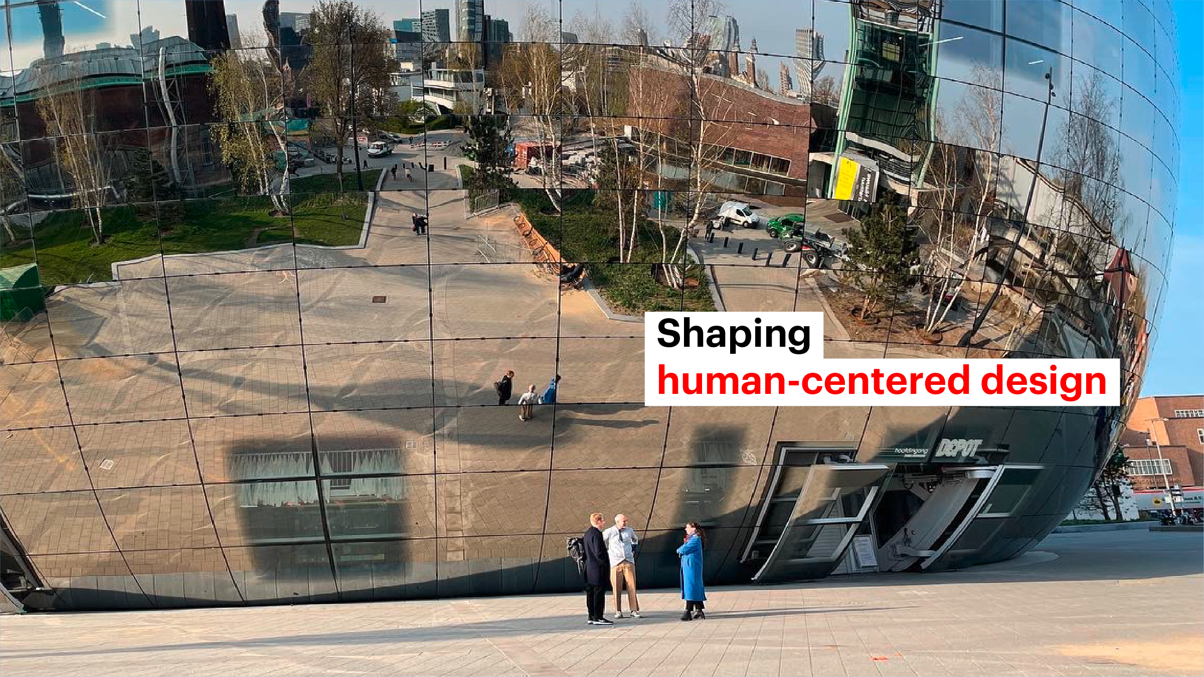
Projects
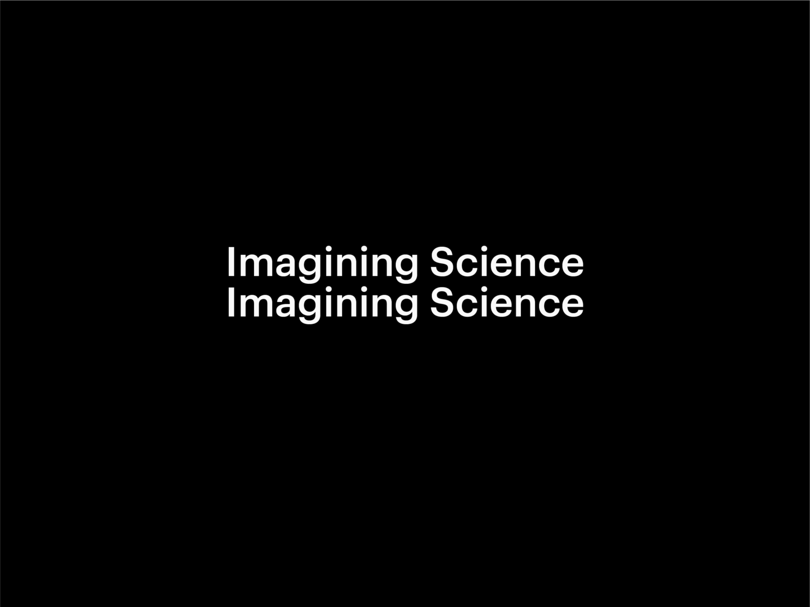
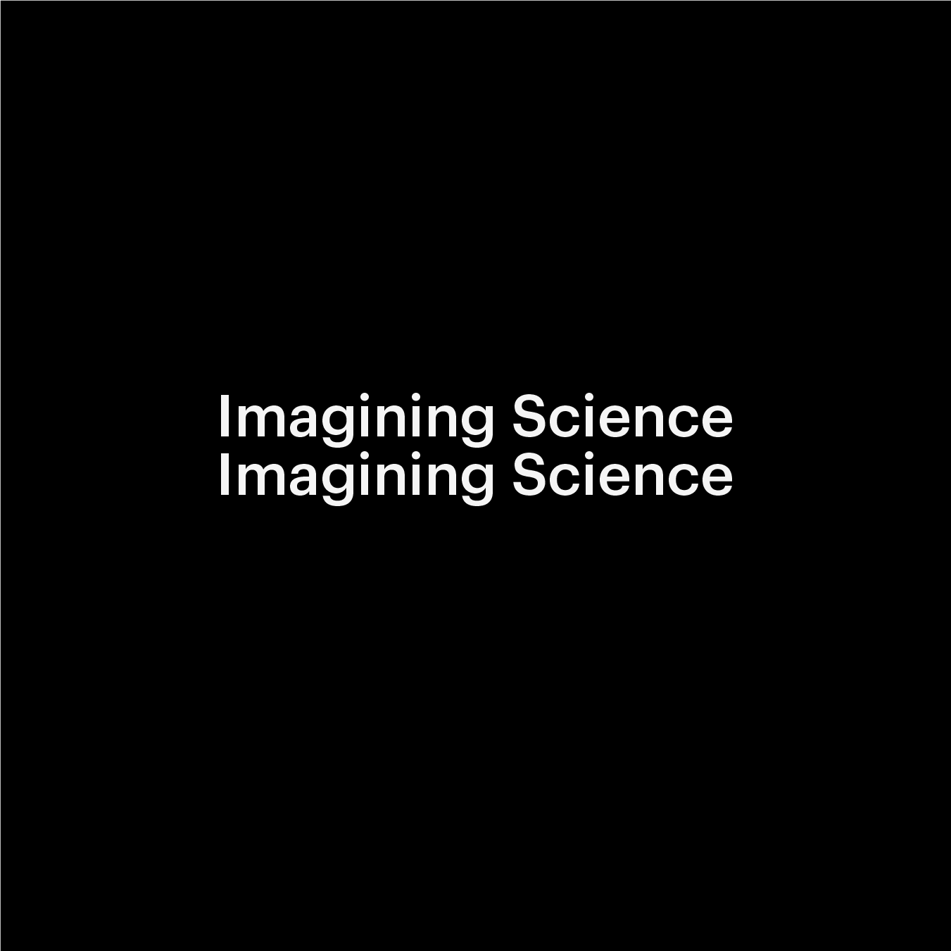
The development of the visual identity of Imagining Science — a crossover of a design research unit, creative lab and consultancy — has been approached as a serendipitous exploration to visual representation and language. The multifaceted and dialectic relationship between the sciences and the arts has been the point of departure. The results emerged from an ongoing design dialogue between designers Simon Davies and Evert Ypma. By looking beyond the obvious and instant communication need the design process and outcomes turned out richer than the initial question.
Research and concept
The design questions the common communication practice of framing dynamic organisational identities, that in their essence are ambiguous, with static and rigid visual representations. With visual identity and branding – cultural techniques – there is always the onus of proving something with the chosen form of representation. Also in science the proof of concept, trust and credibility of the argument is a central notion that is supported by text and image.


Linguistic generator
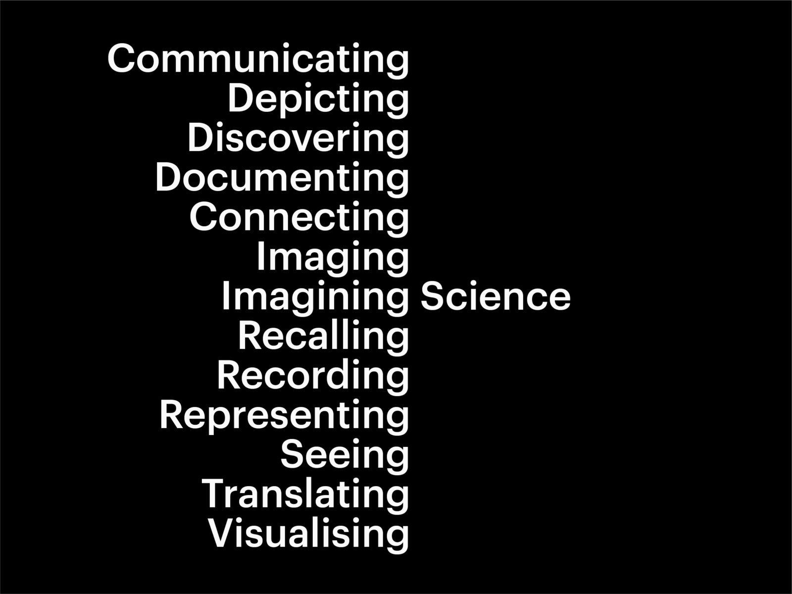
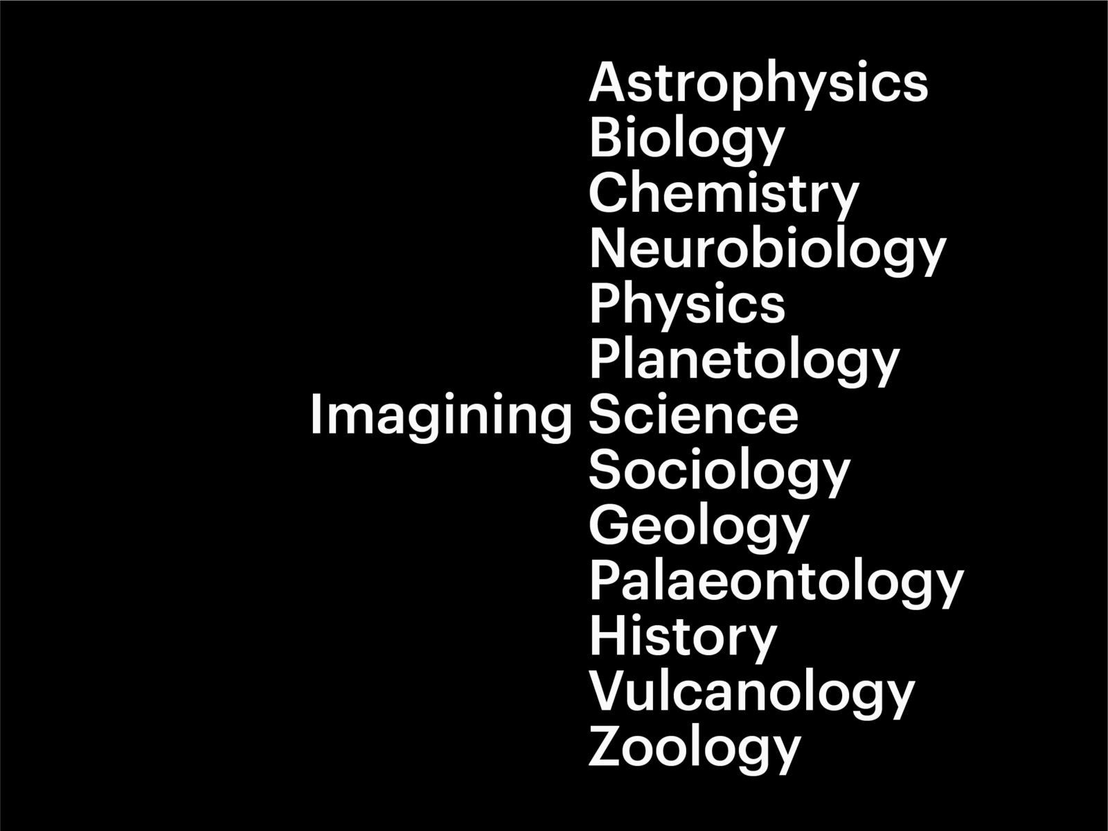
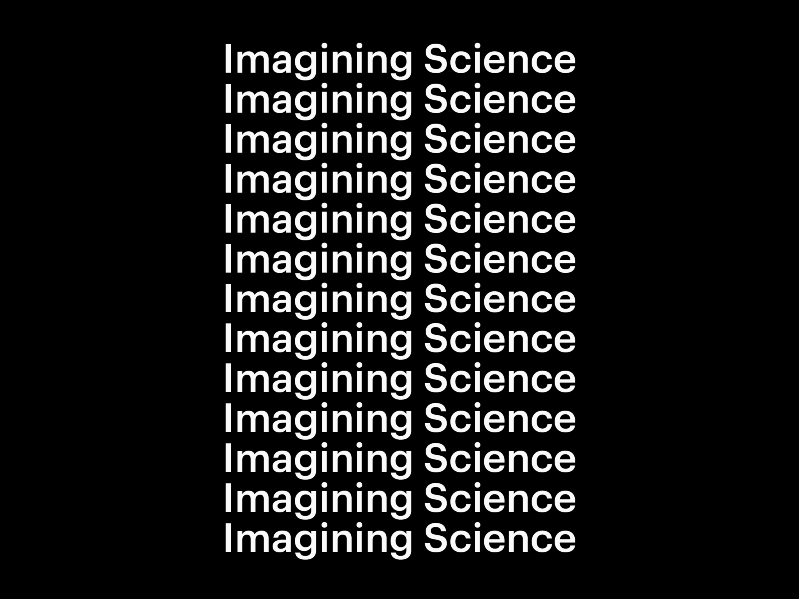
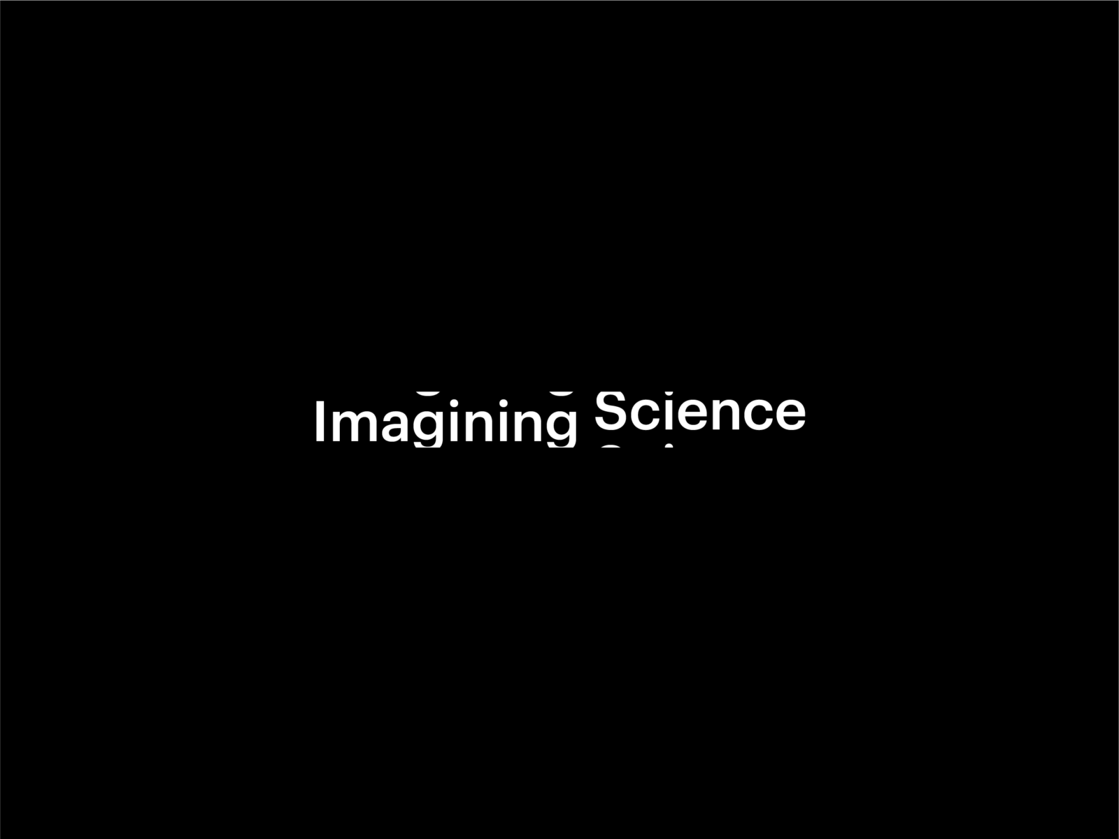
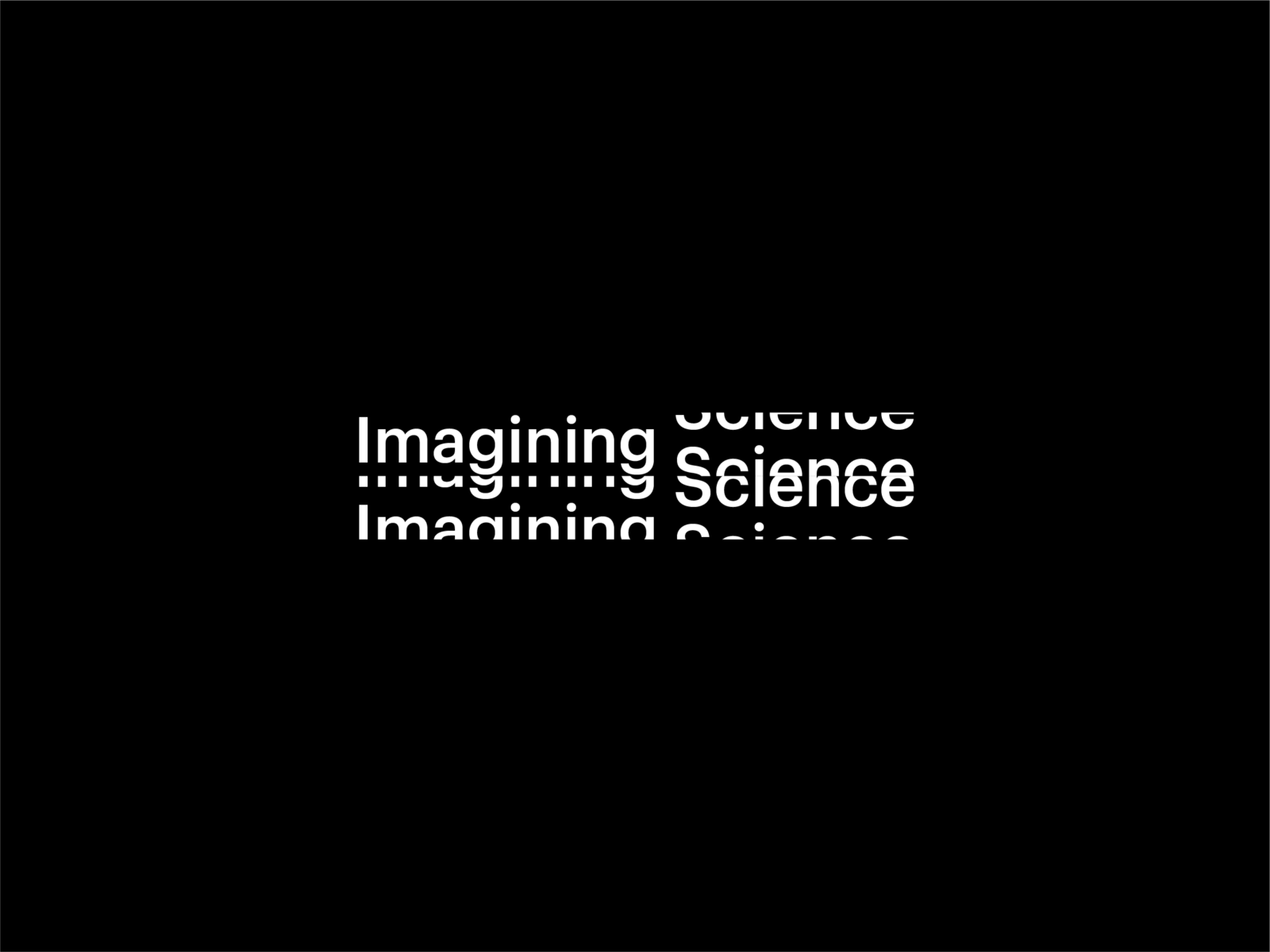
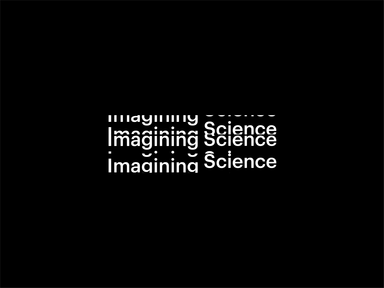
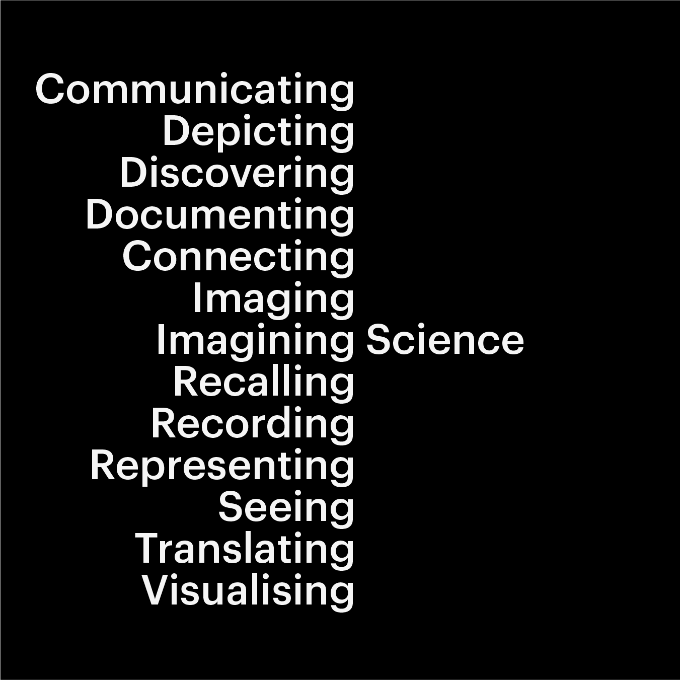
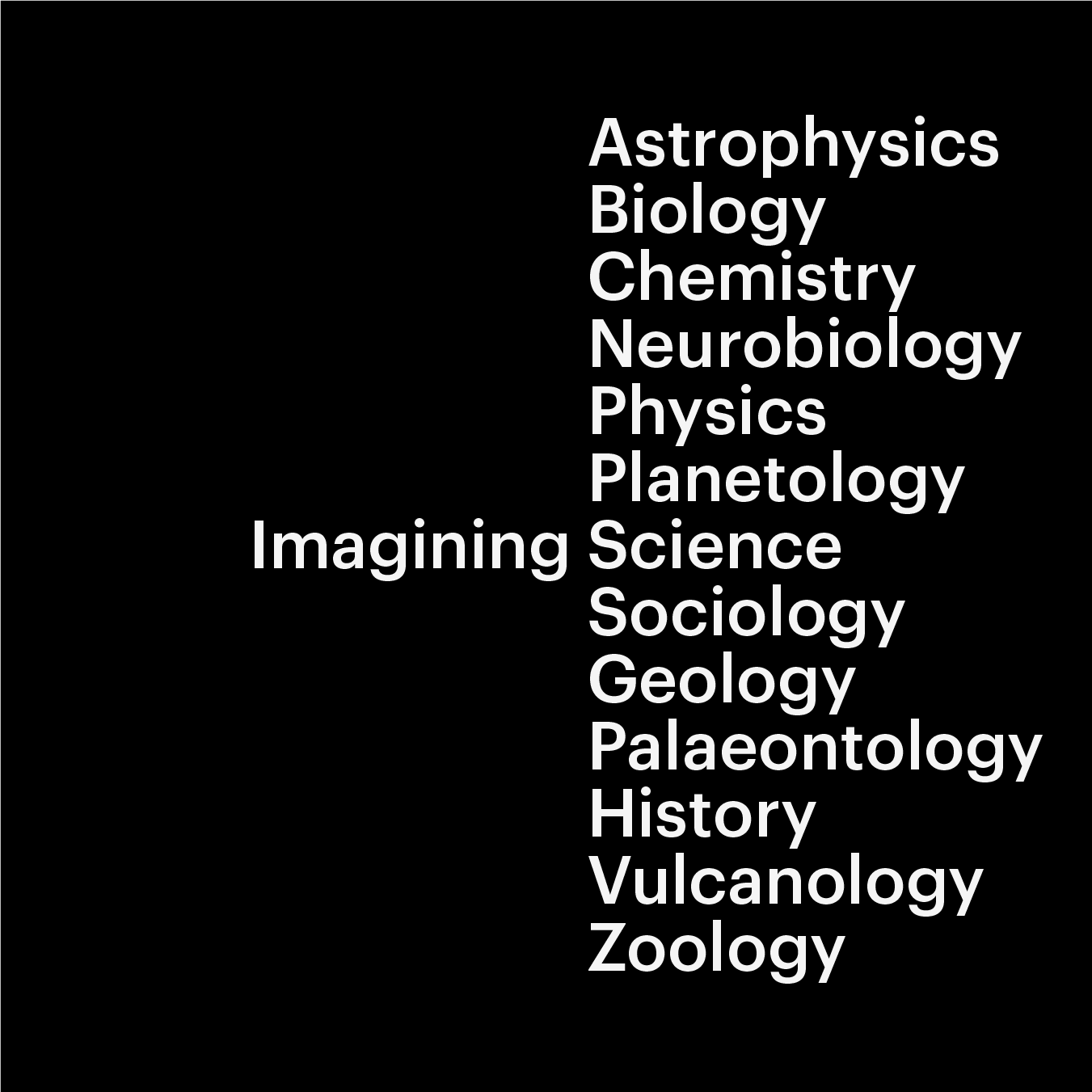
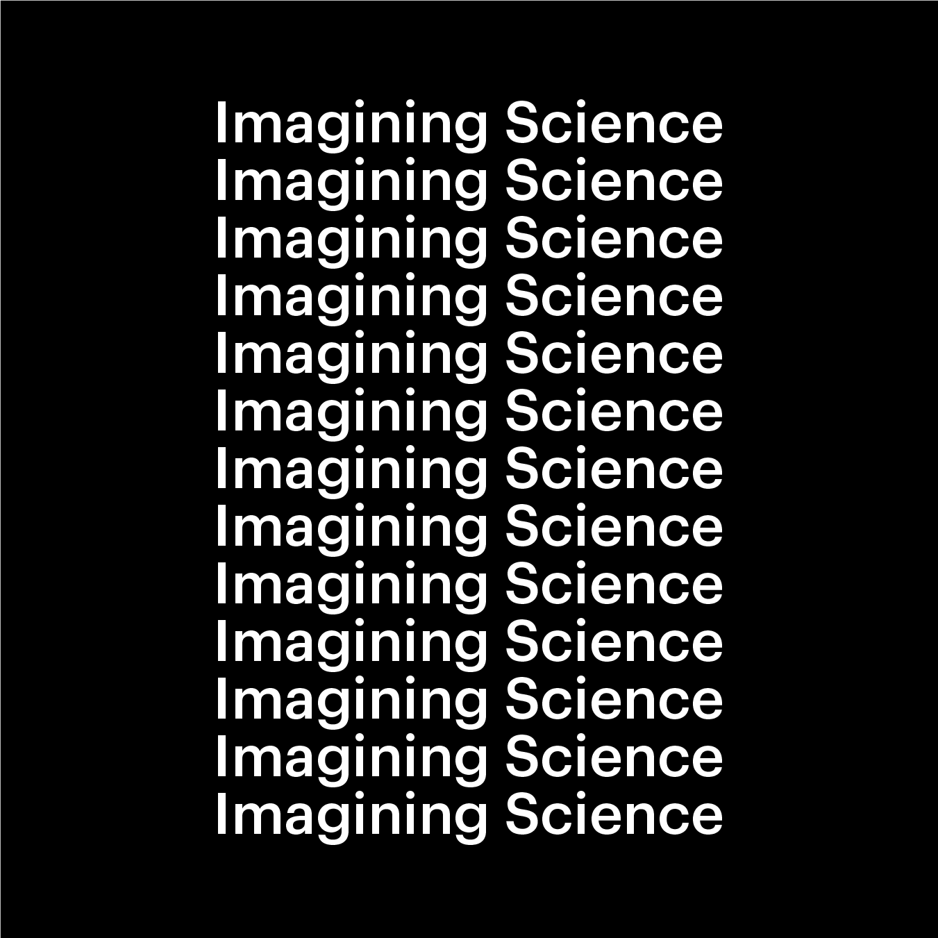
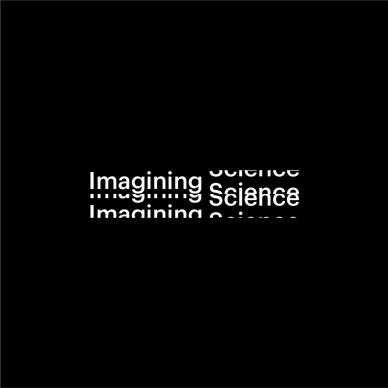
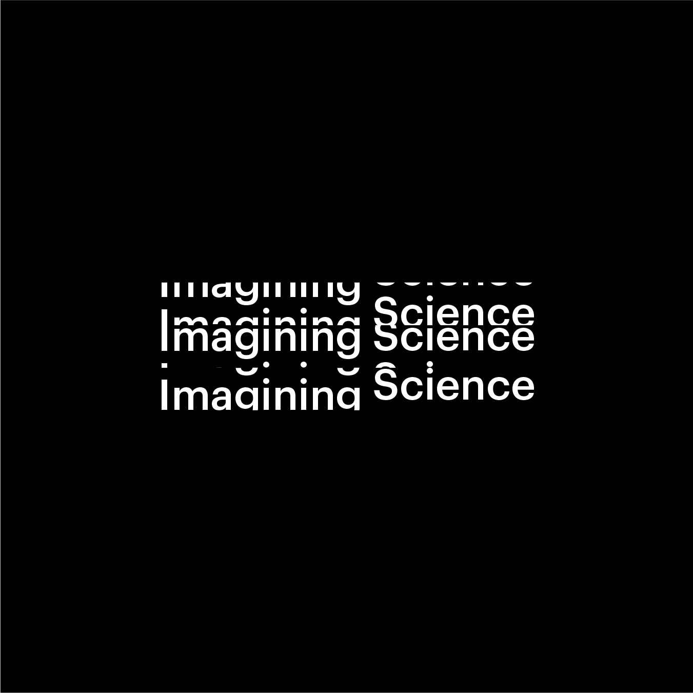
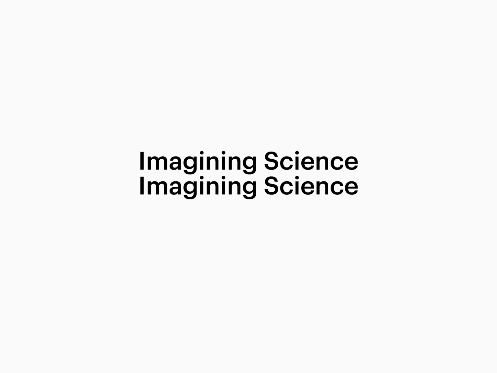
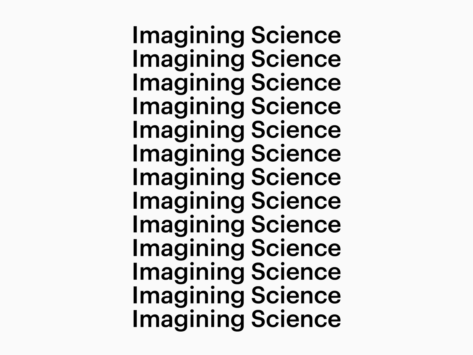
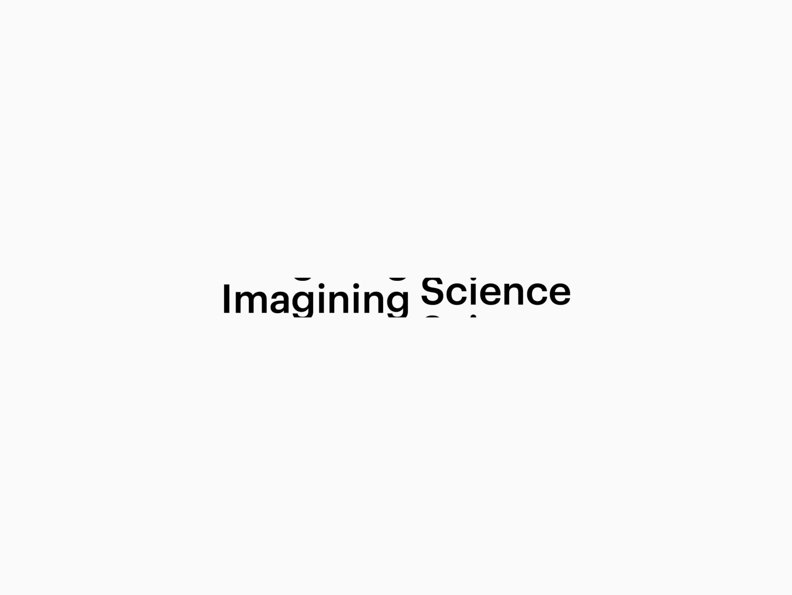
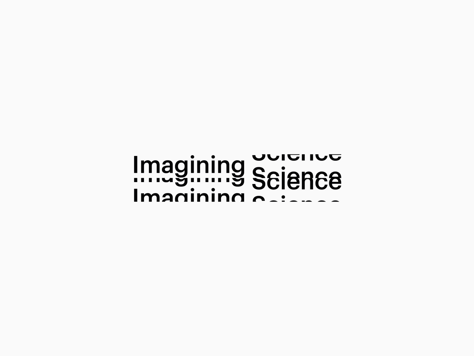
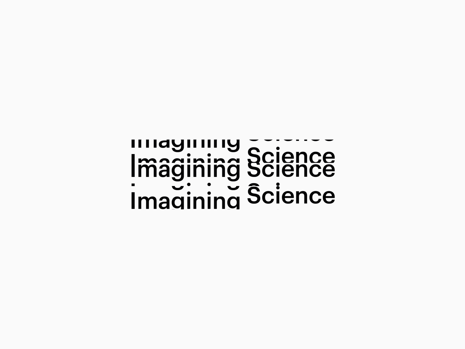
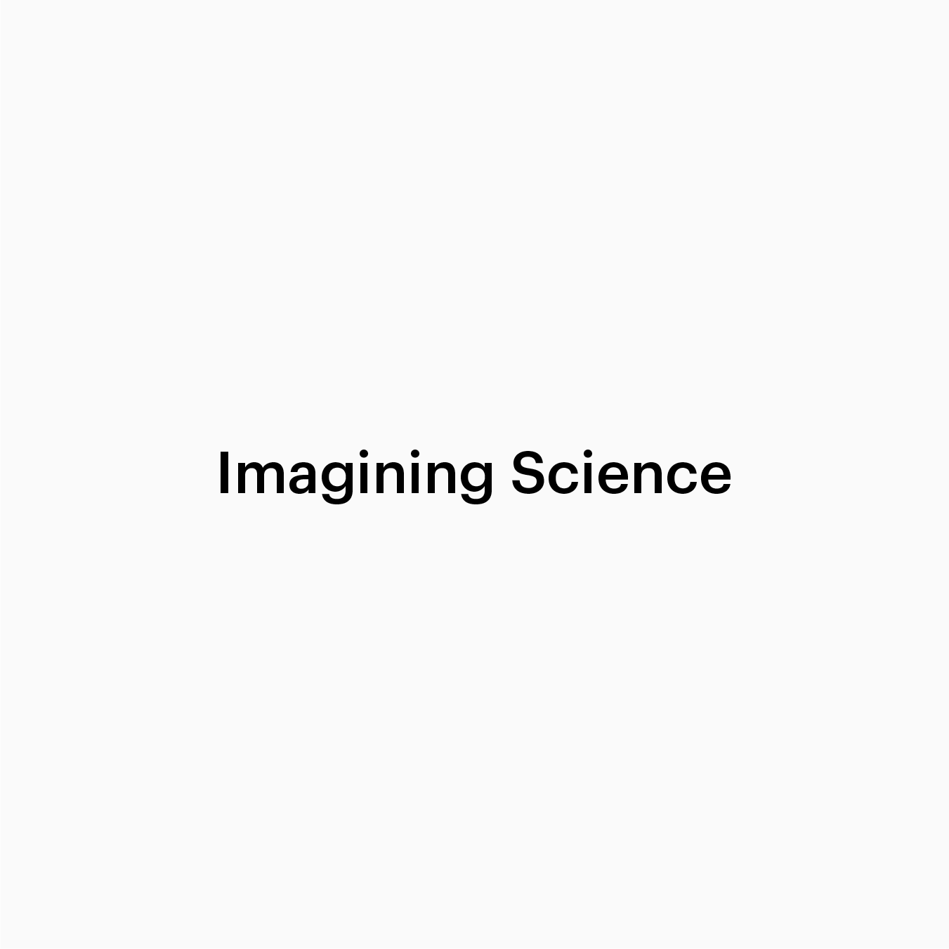
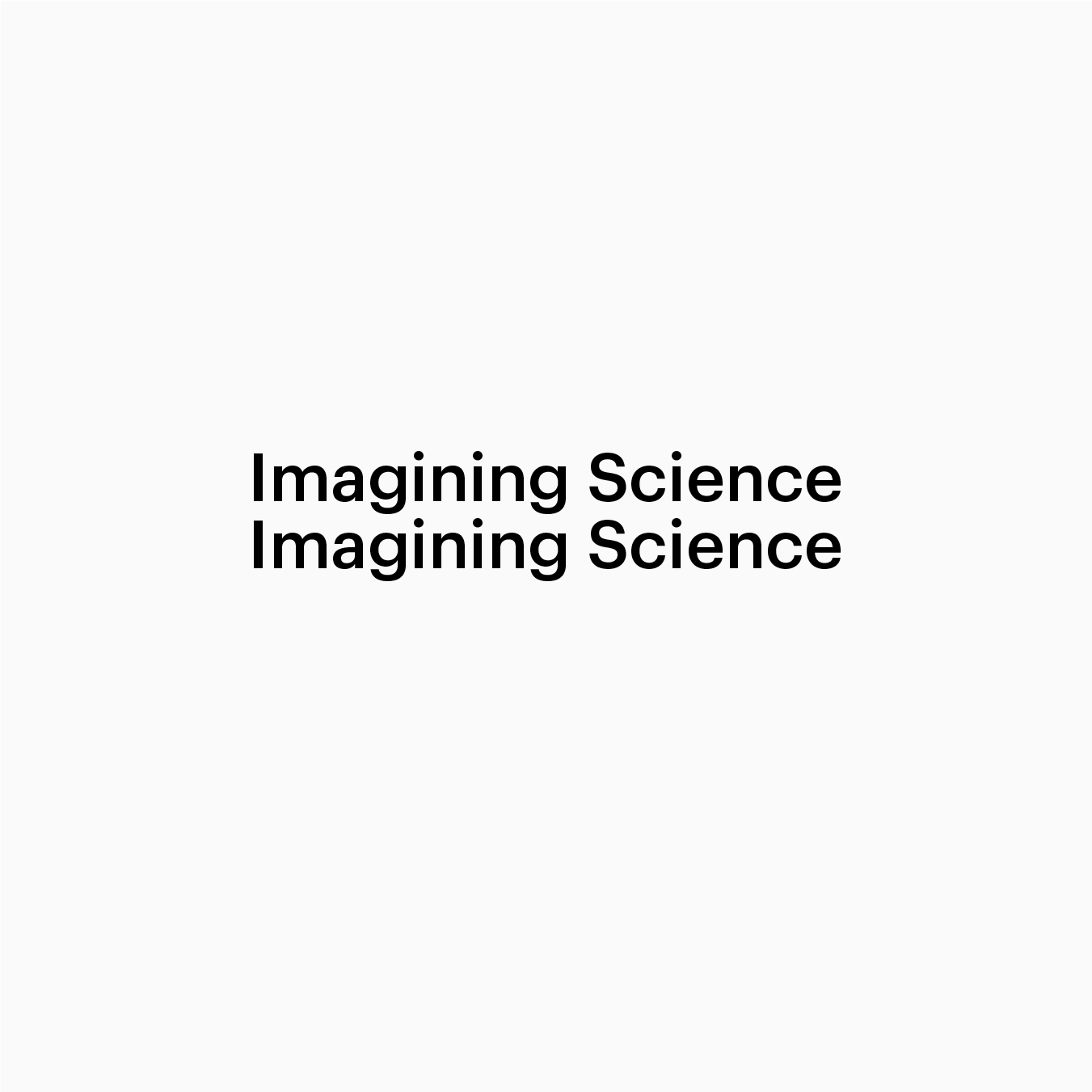
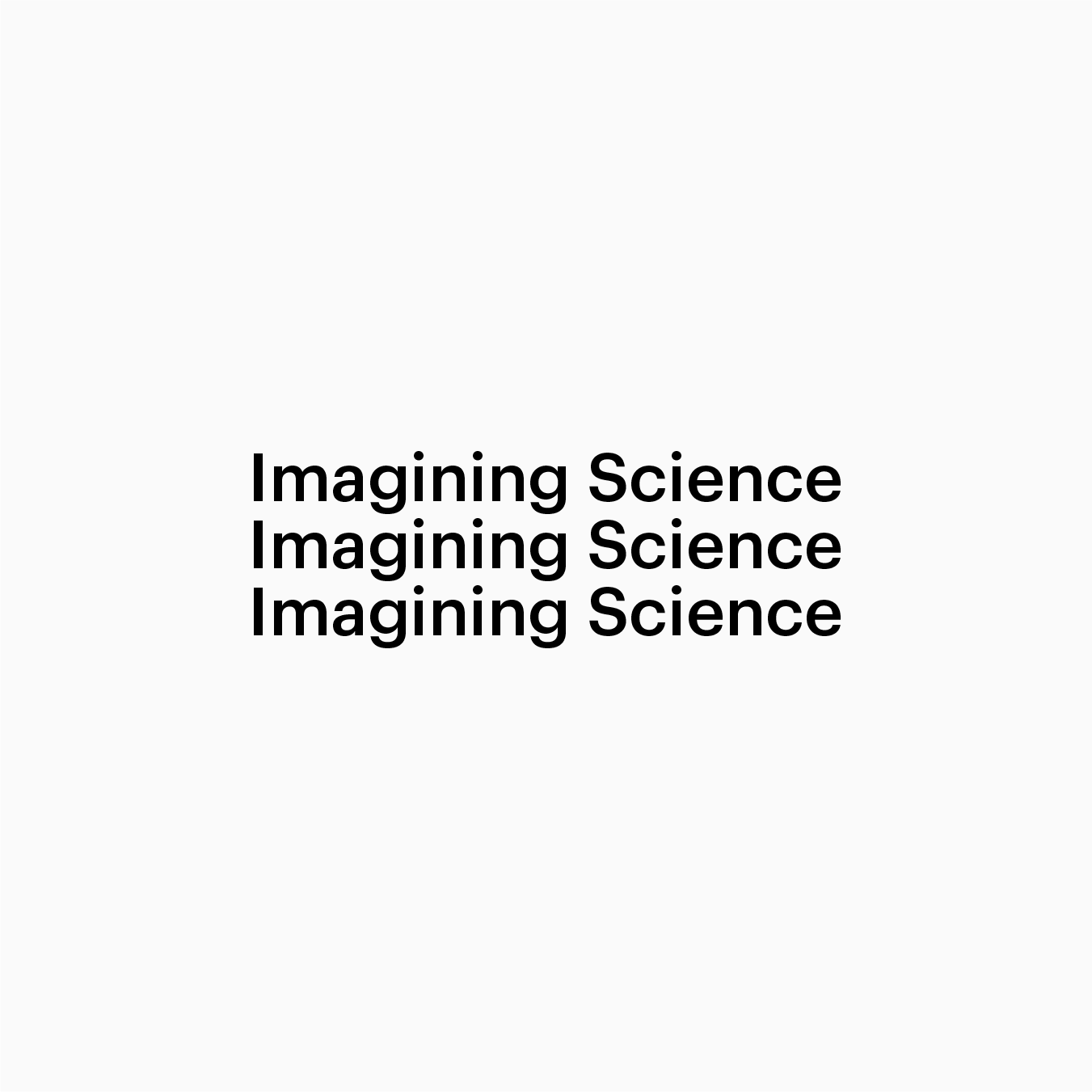
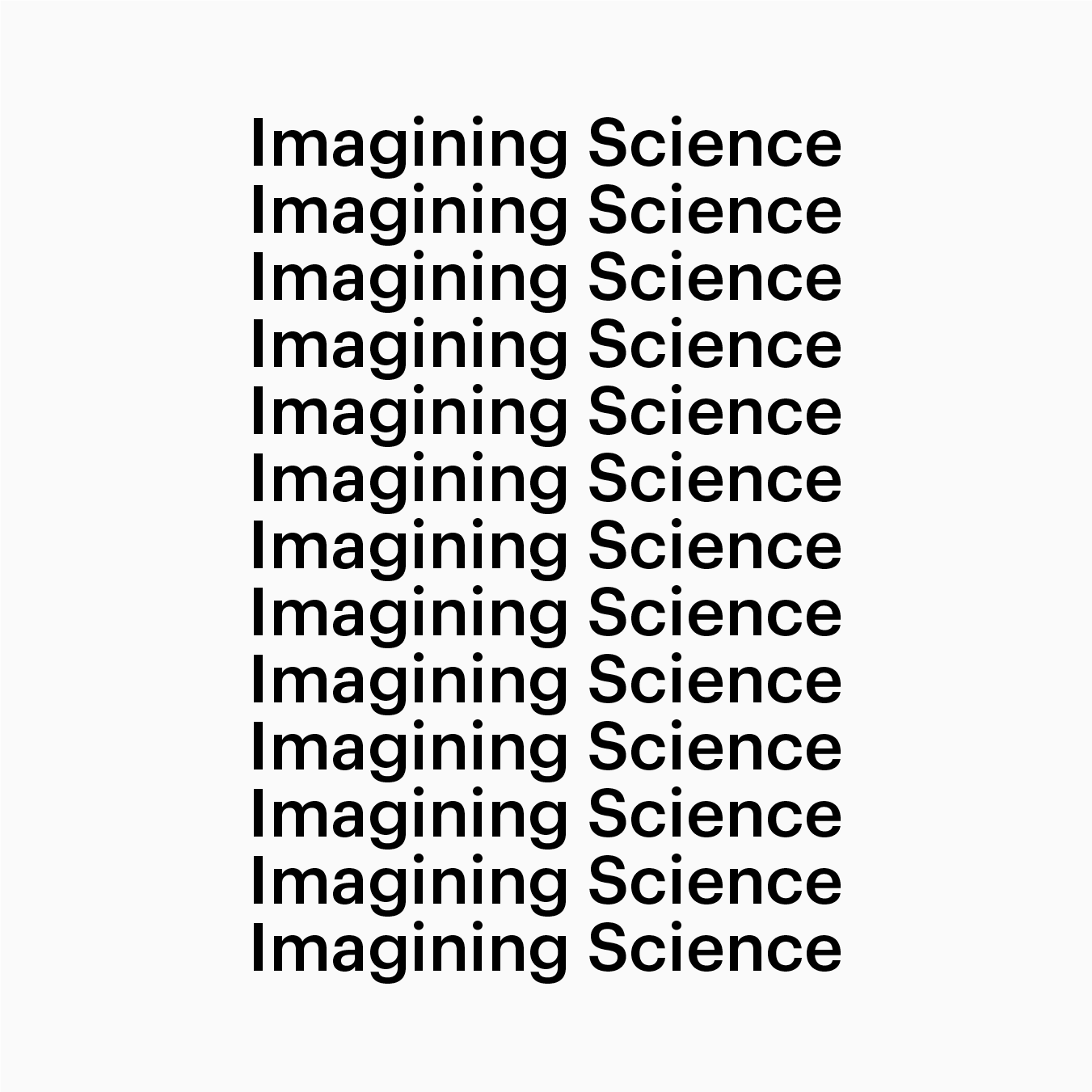
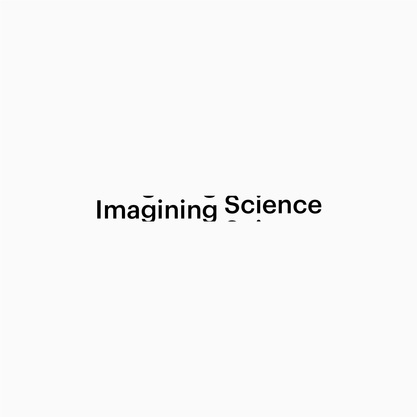
The logotype functions as a linguistic generator that can produce infinite configurations, also versions not yet anticipated. These inexhaustible compositions do justice to the multiplicity of science and artistic creation. The visual identity can be presumed as a form of discourse about the relation between both fields. Image and text are two elementary devices present in science and in design which enables its practitioners to imagine, think and express ideas from multiple viewpoints. Be it 19th century botanical art or digital imaging technologies, science founded on the principles of observation – visualisation – and description – language. A
Paradigmatic relationship
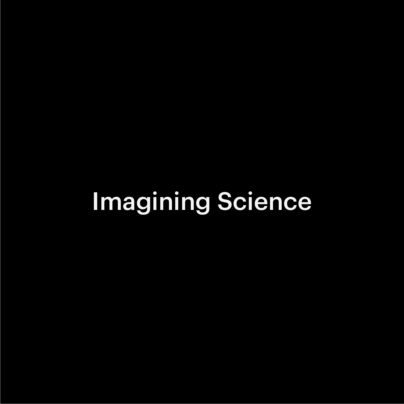
In the arts in general, and in communication design, the arrangement of text and image wether incentivised by personal (emotional) expression or by rationality, sparks imagination and opens up room for new interpretation. The logotype is a linguistic device rather than an illustration.
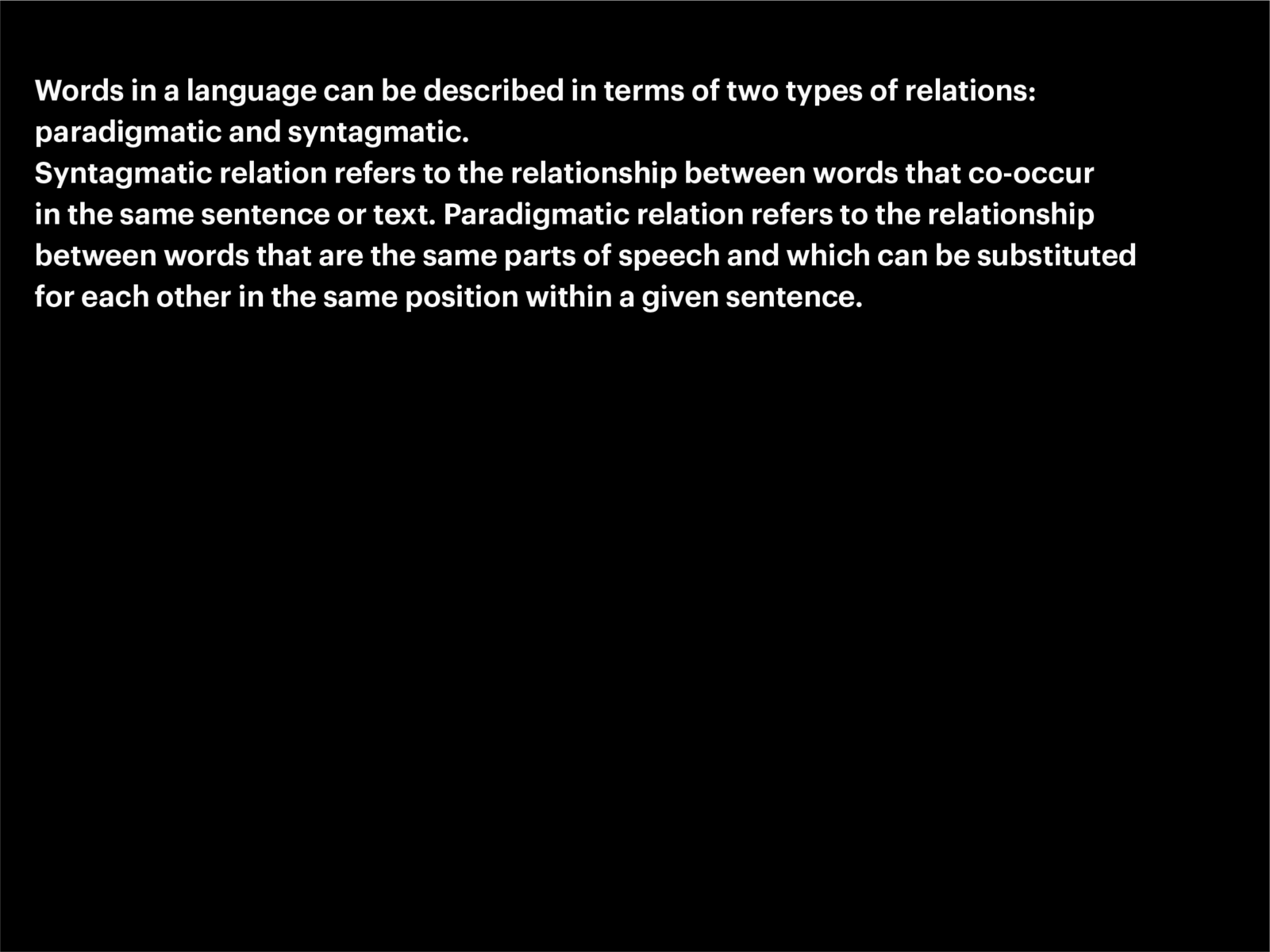
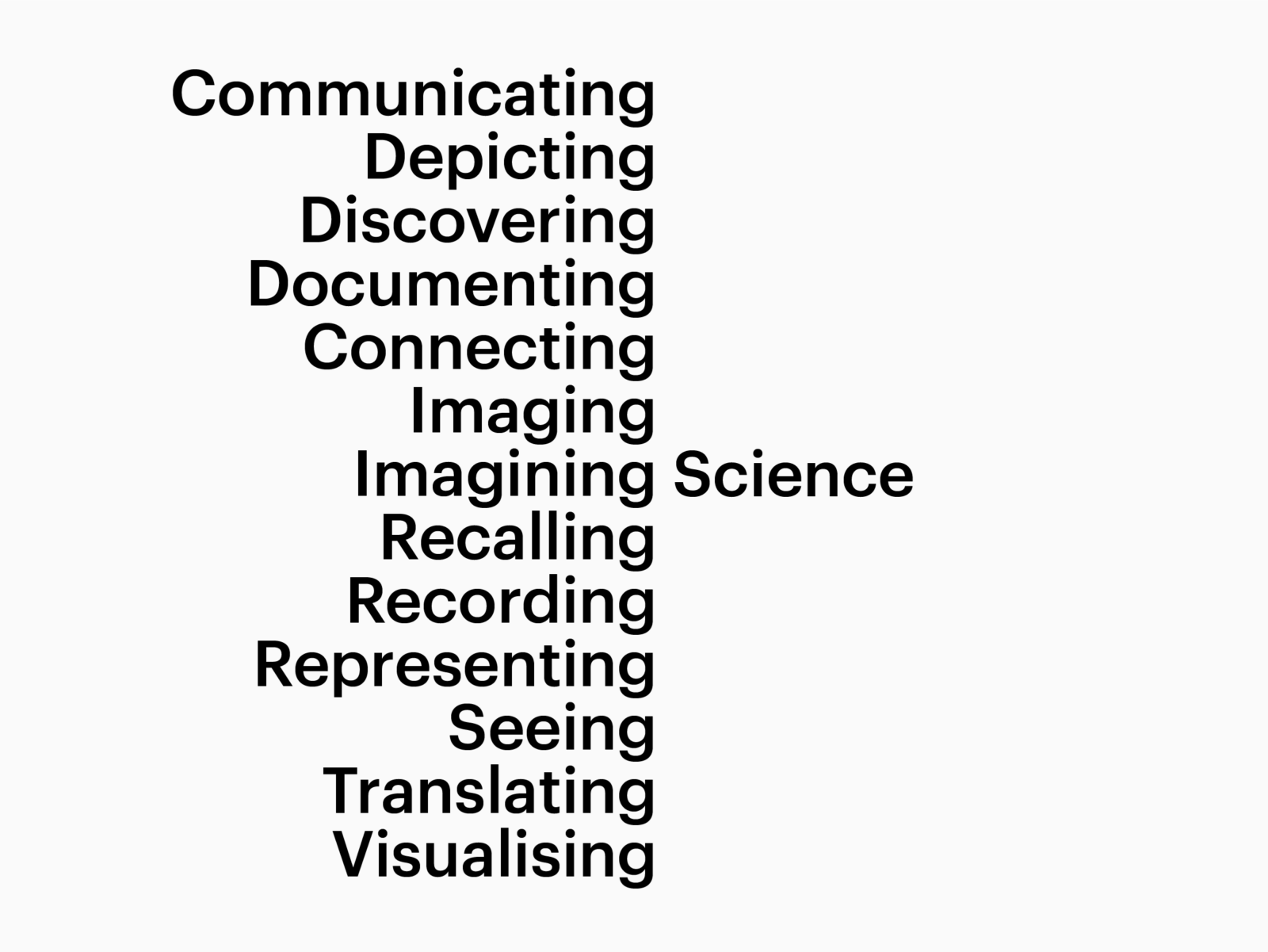
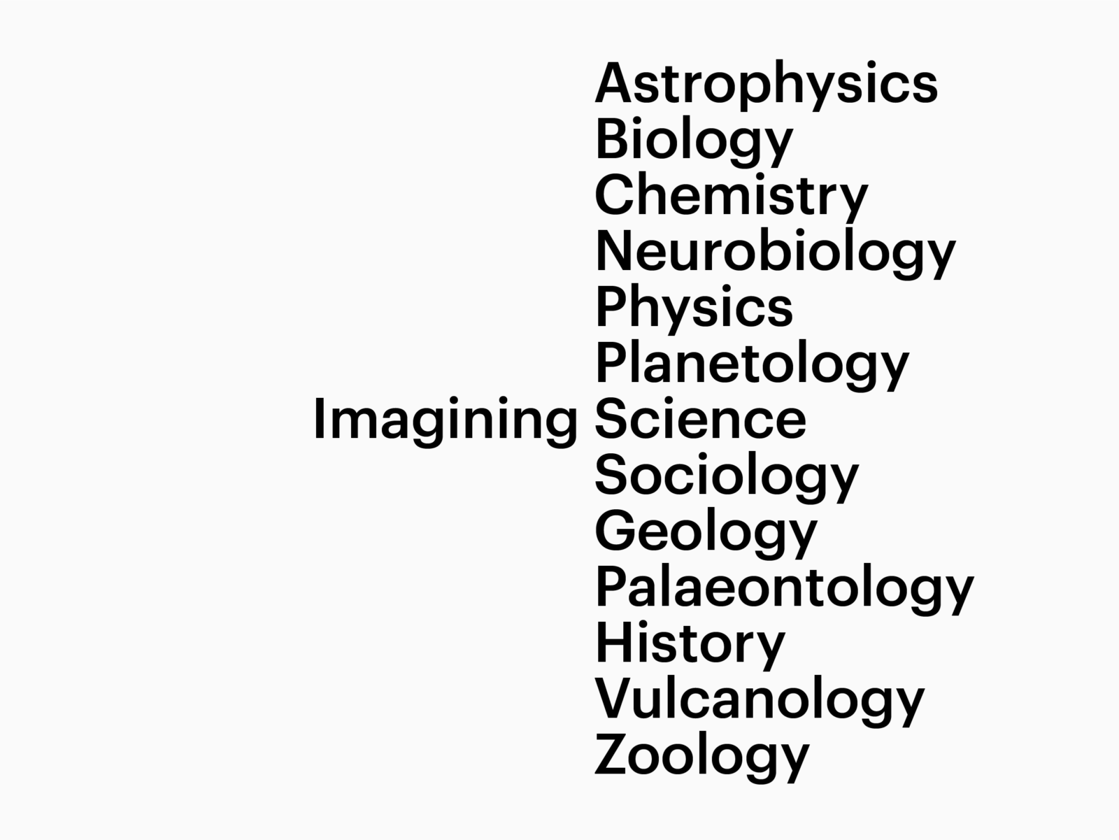
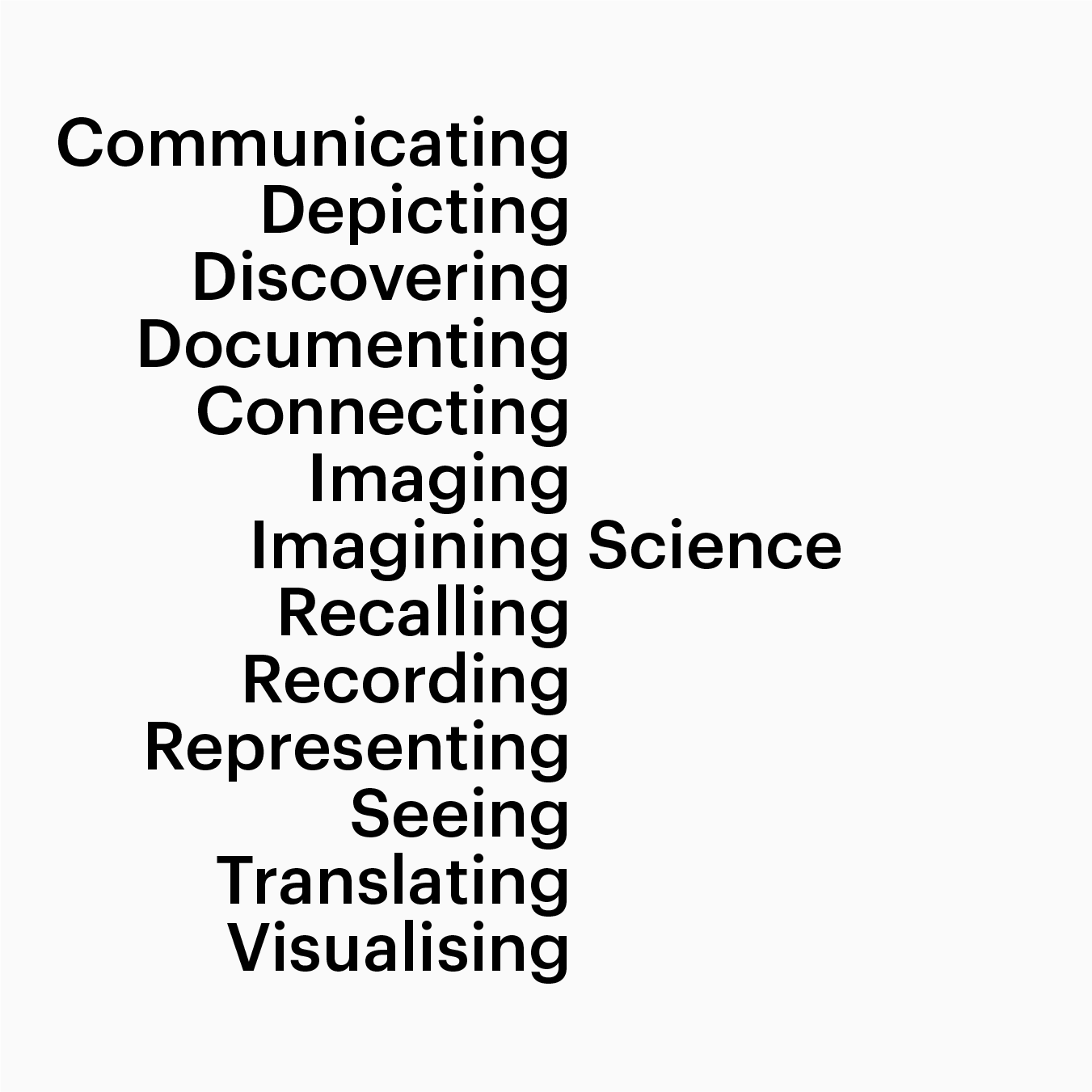
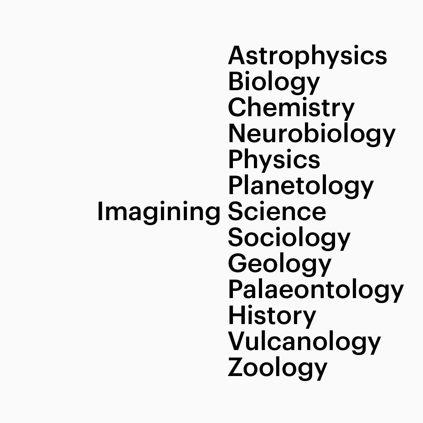
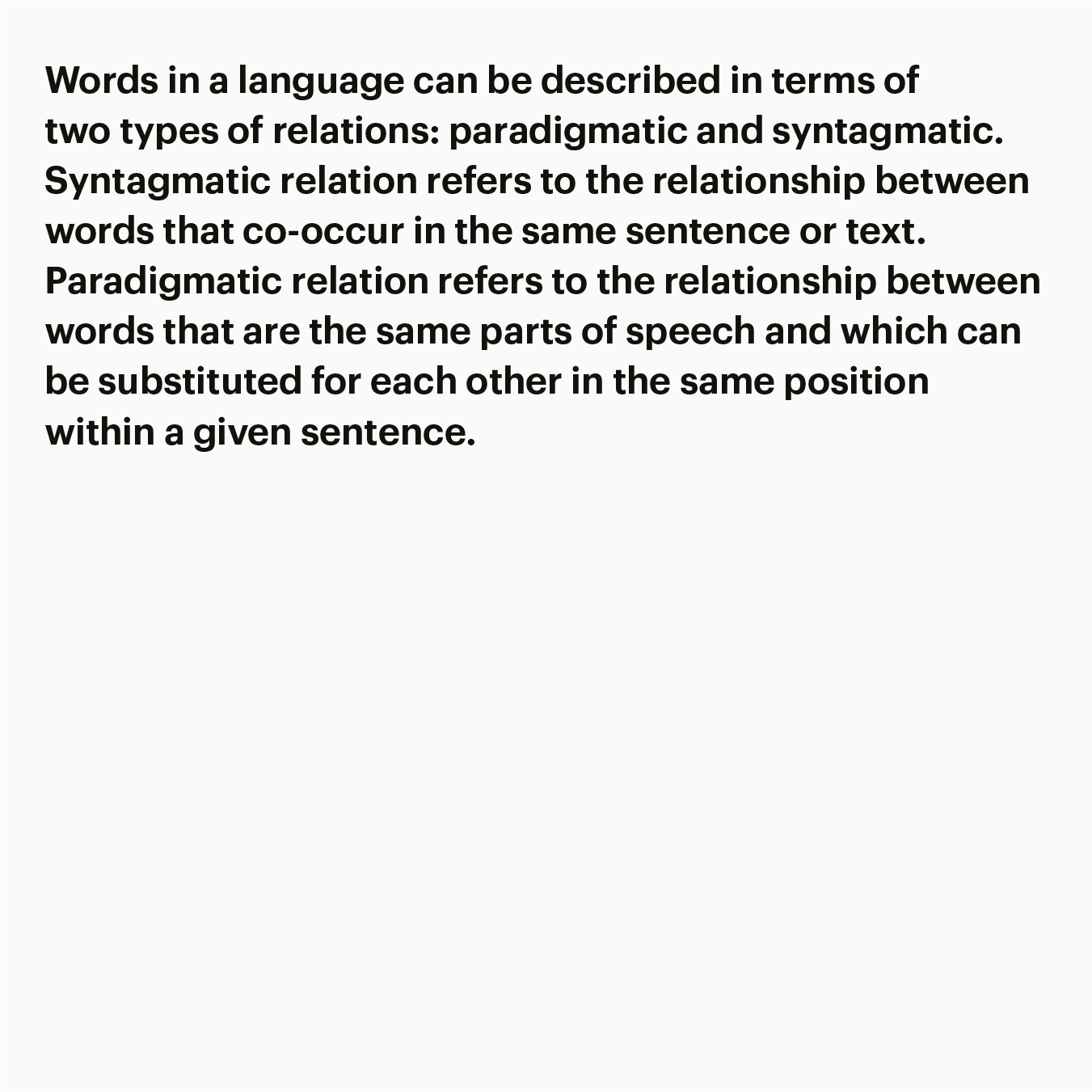
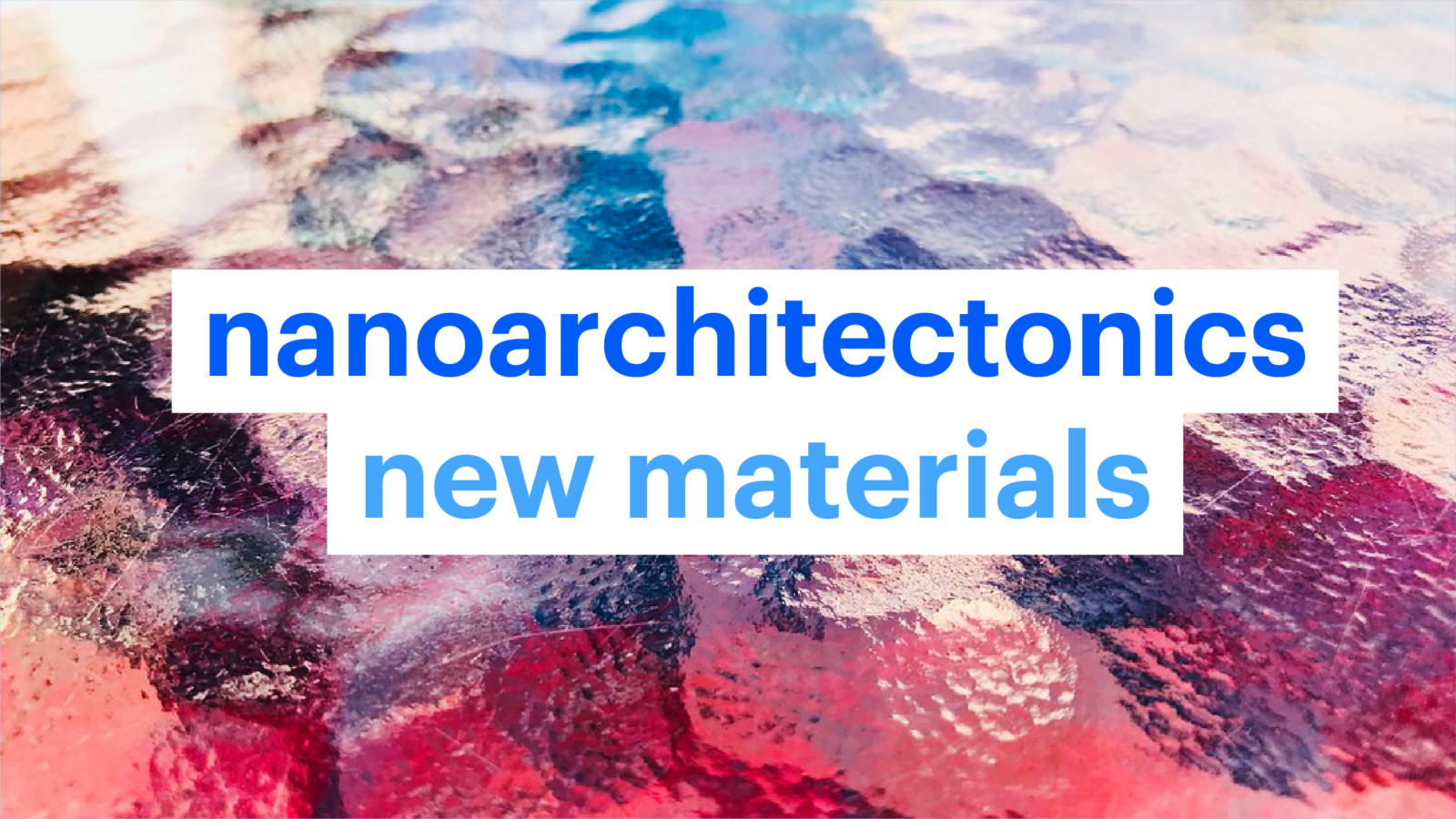
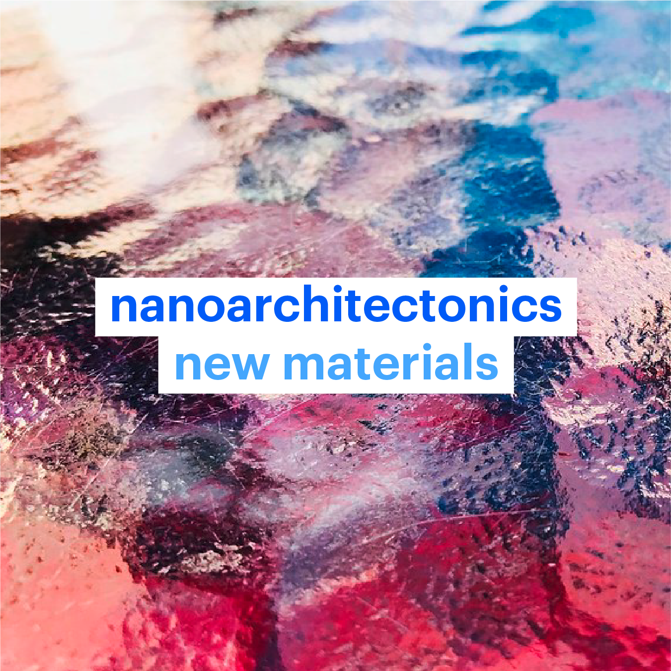
Words in a language can be described in terms of two types of relations: paradigmatic and syntagmatic. N1 ‘Imagining’ can be replaced by other words in present participle, such as drawing, observing, making, changing and other actions. ‘Science’ can be exchanged with other scientific nouns. By combining actions and nouns the logotype can generate numerous connotations to grasp the diversity and complexity of science and arts.
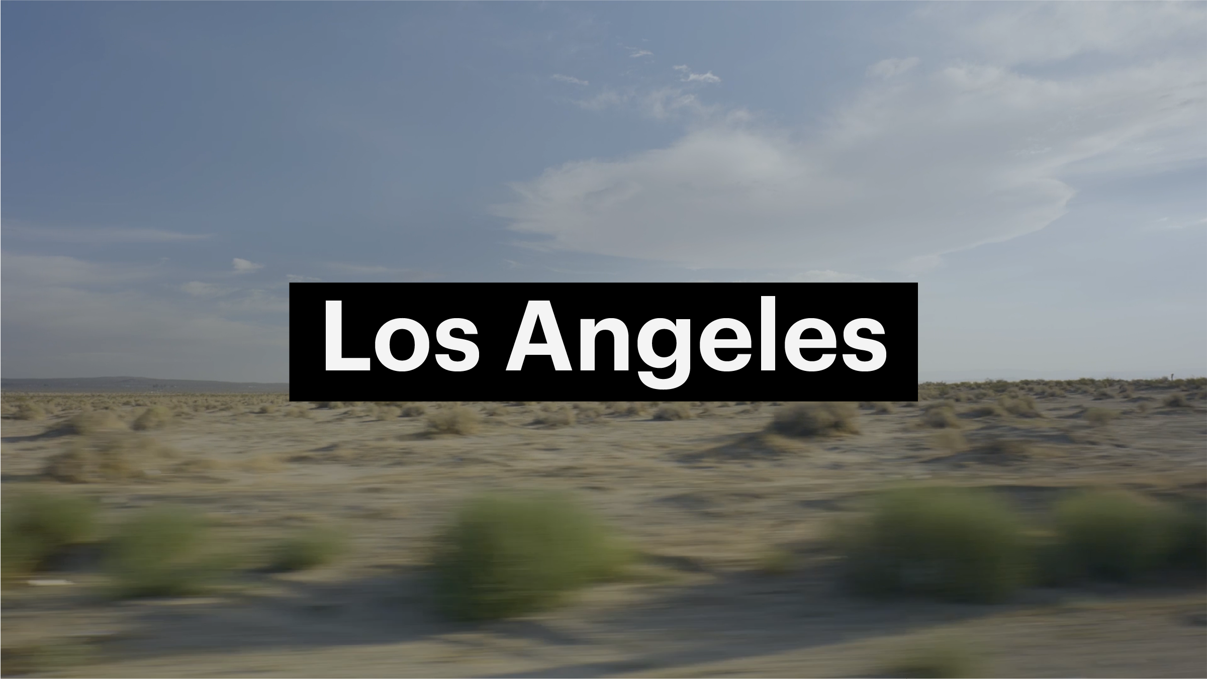
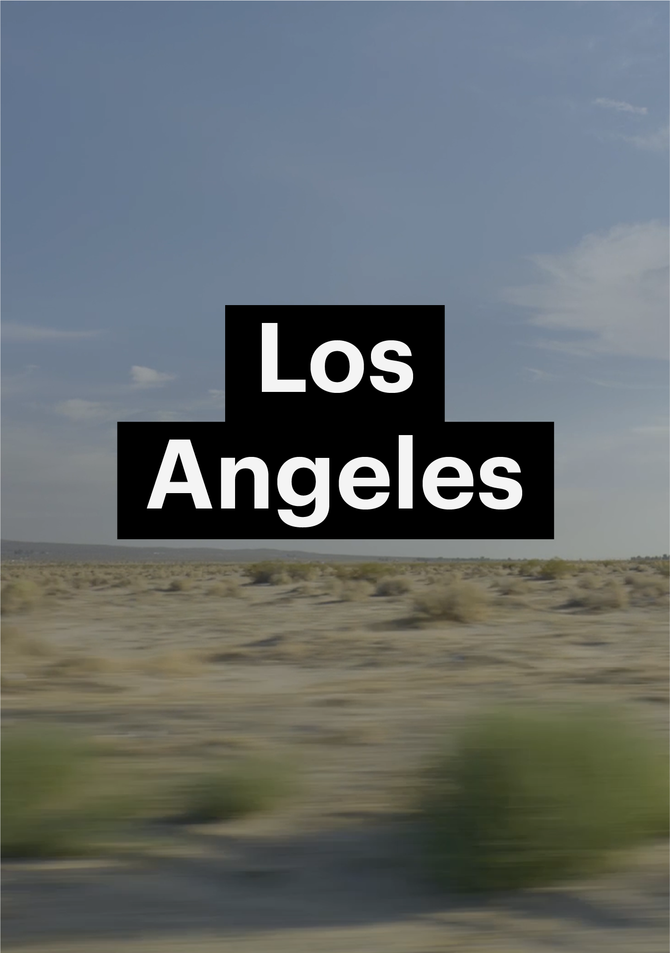
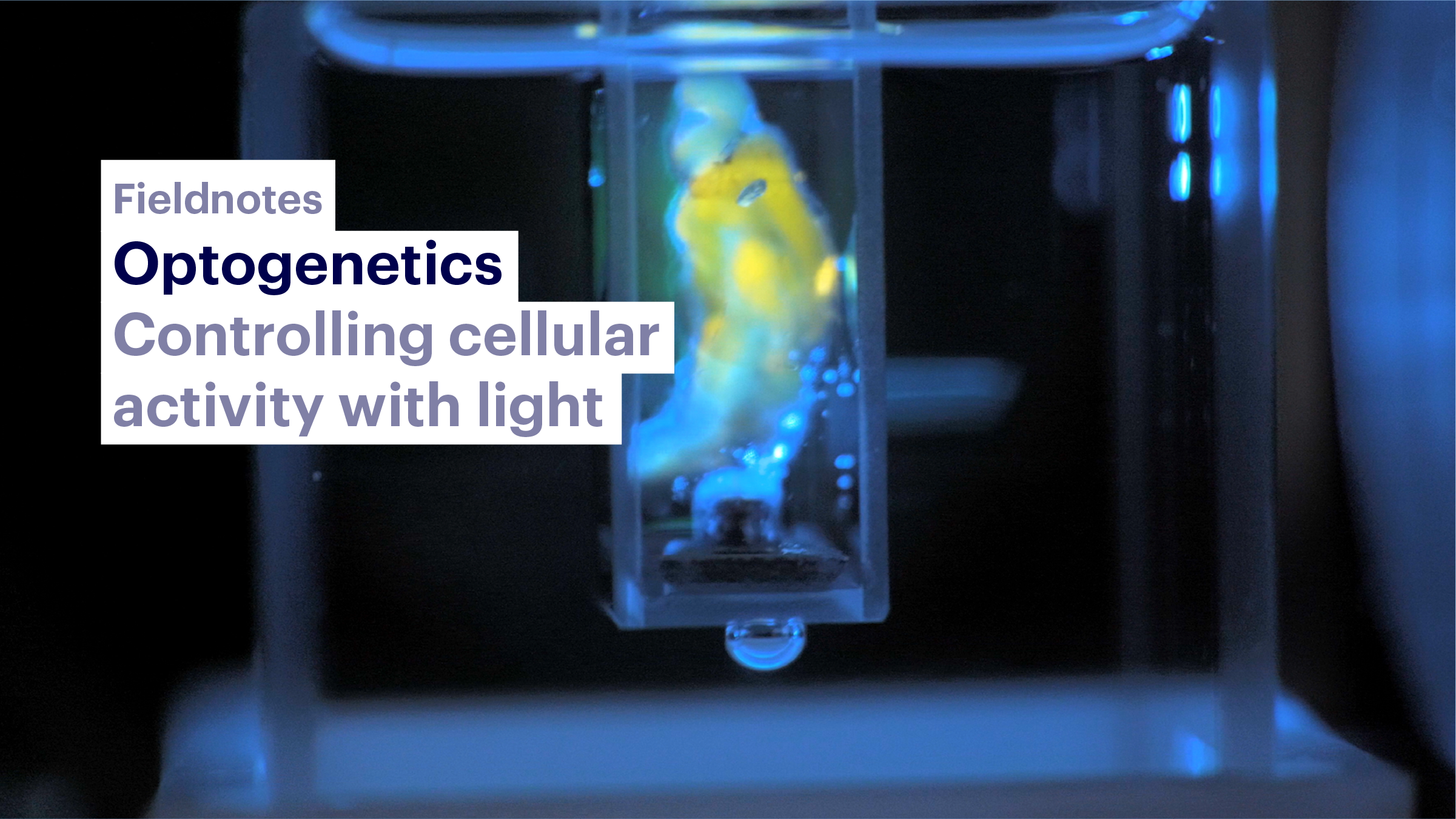
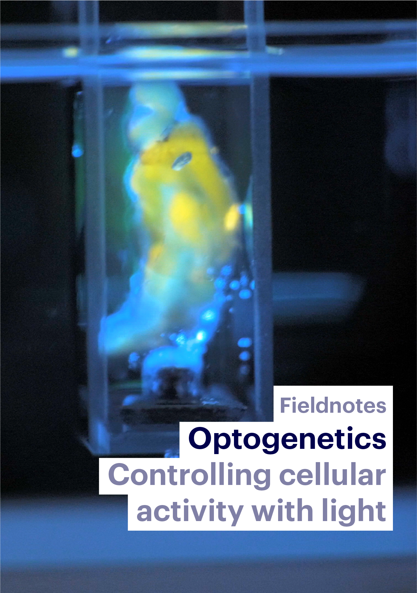
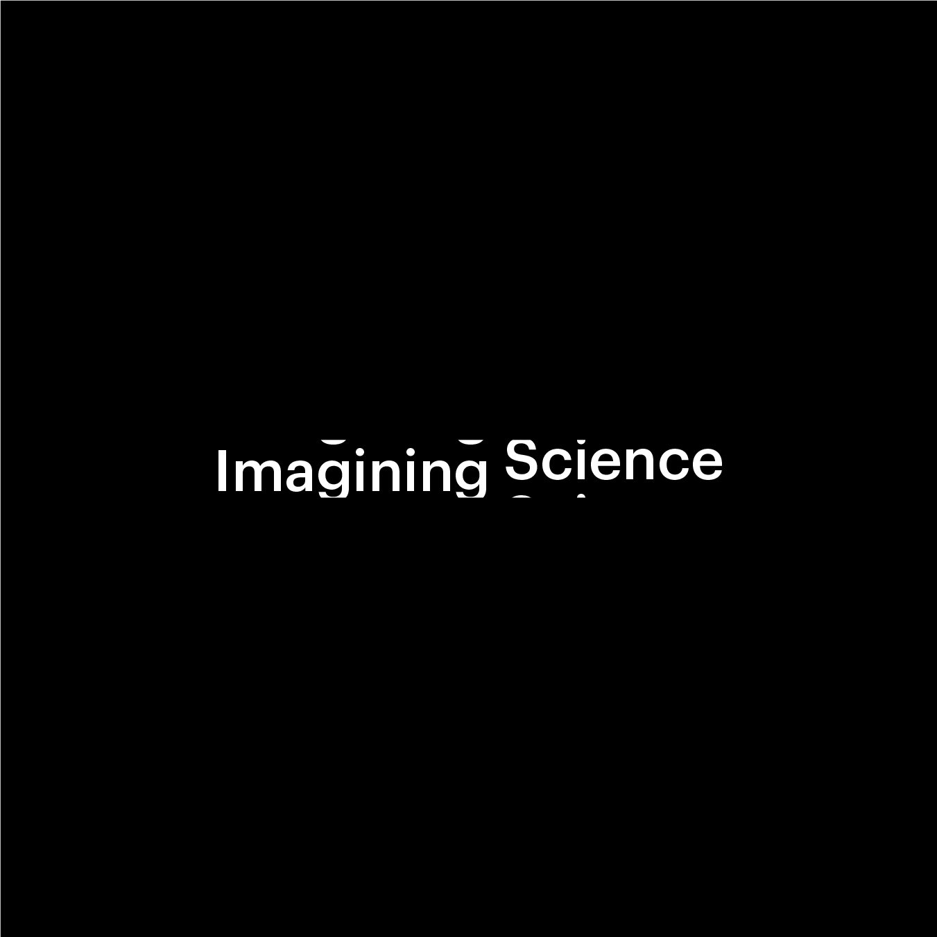
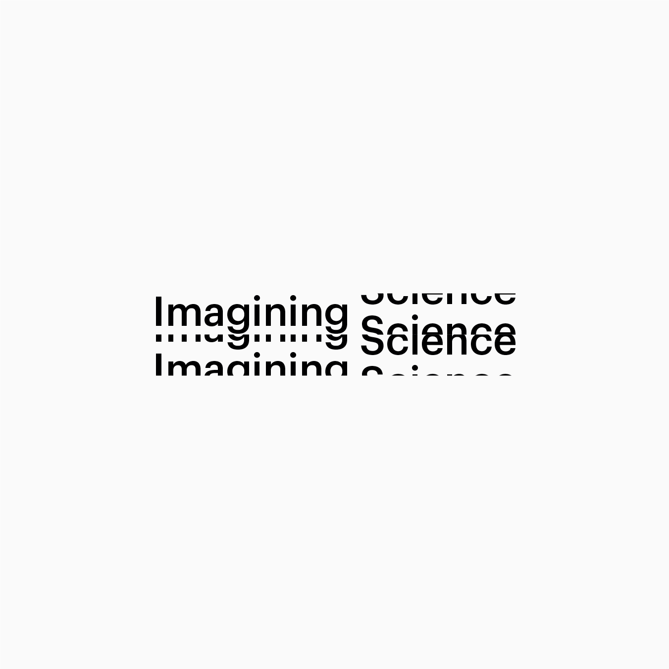
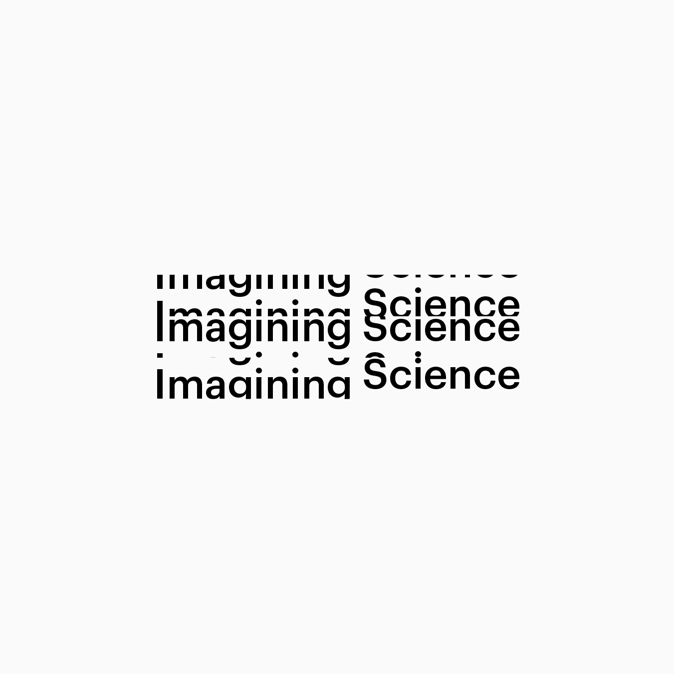
Dynamic visual identity
A similarity between science and design is its processual, iterative and evolving nature. Every design has a temporary status since it always can be adapted. In science every finding opens a new venture for further research. The iterative and narrational quality of scientific and creative practice lead to a design concept that is based on the idea of movement.
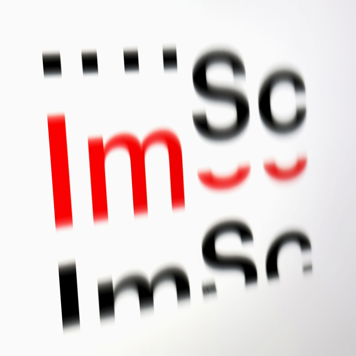
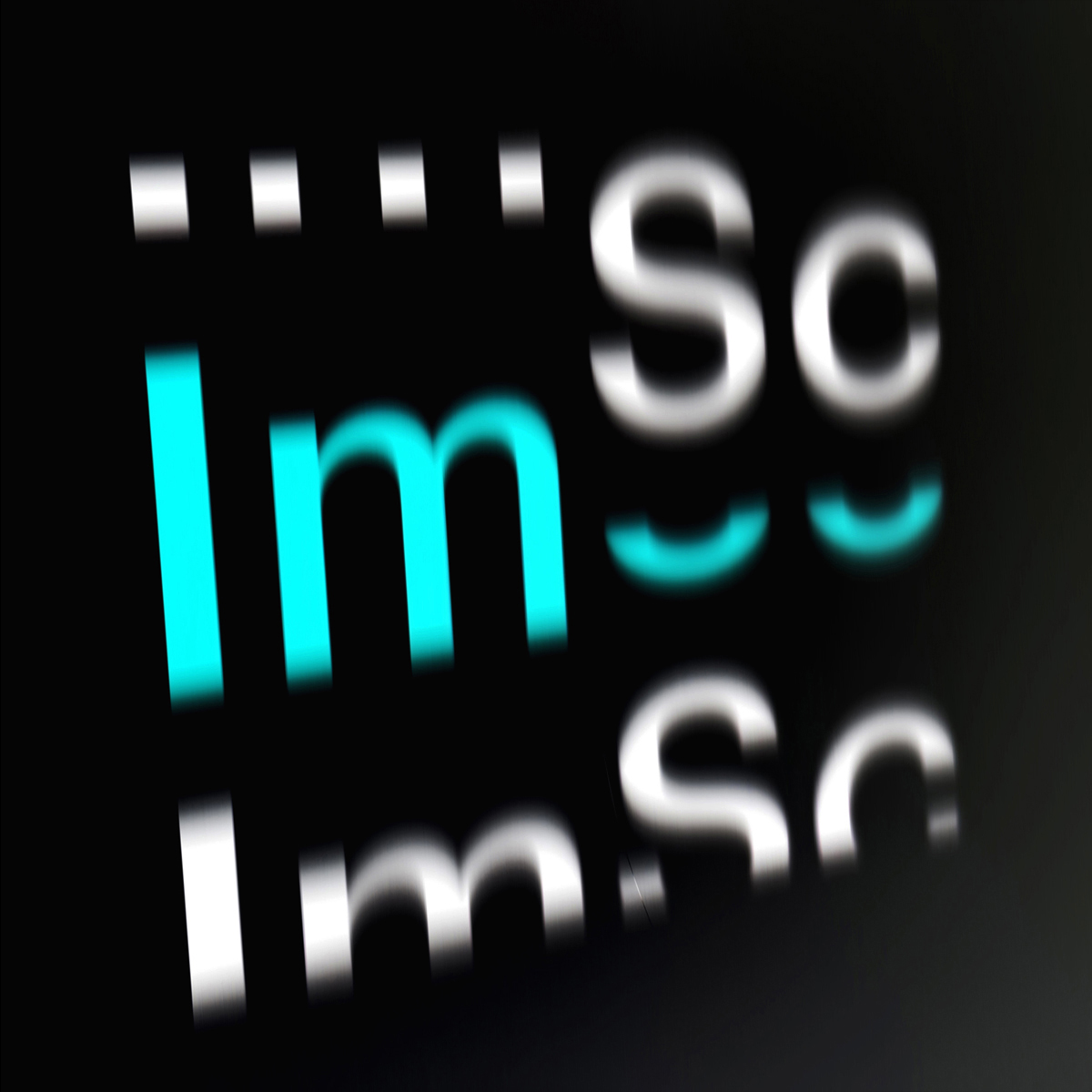


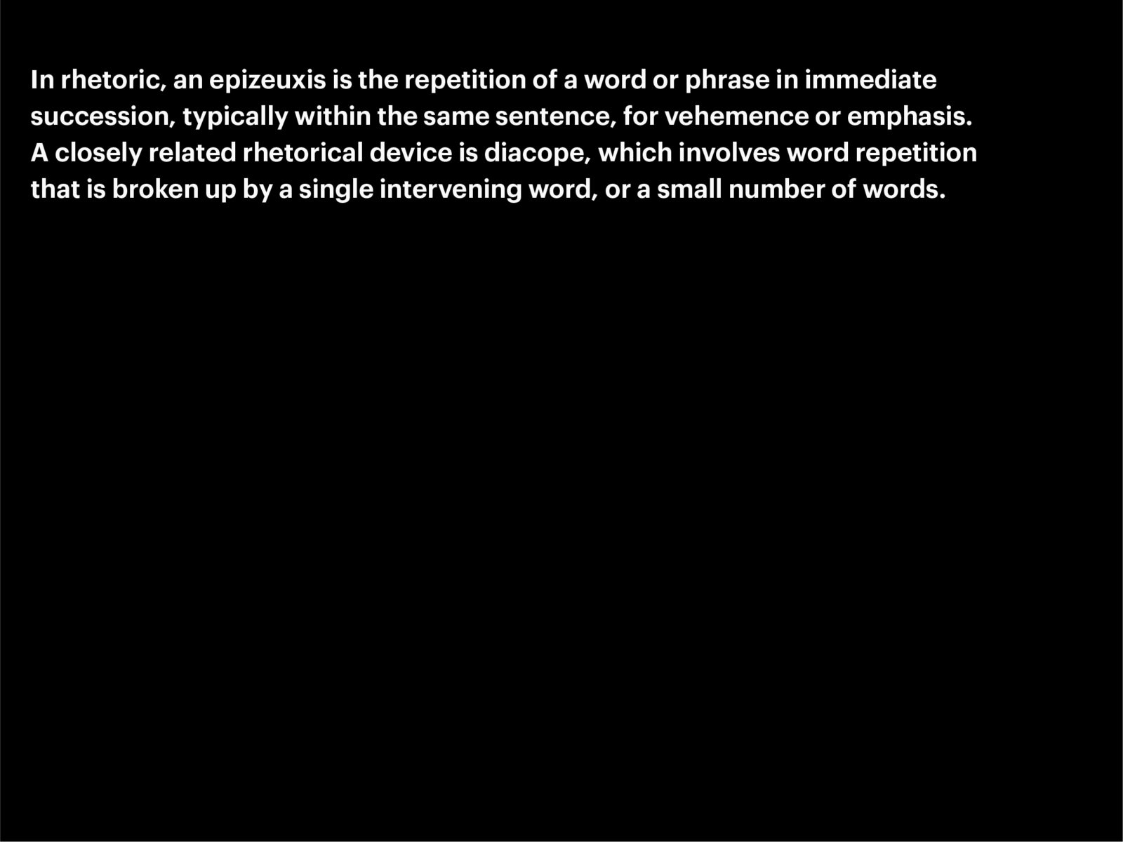
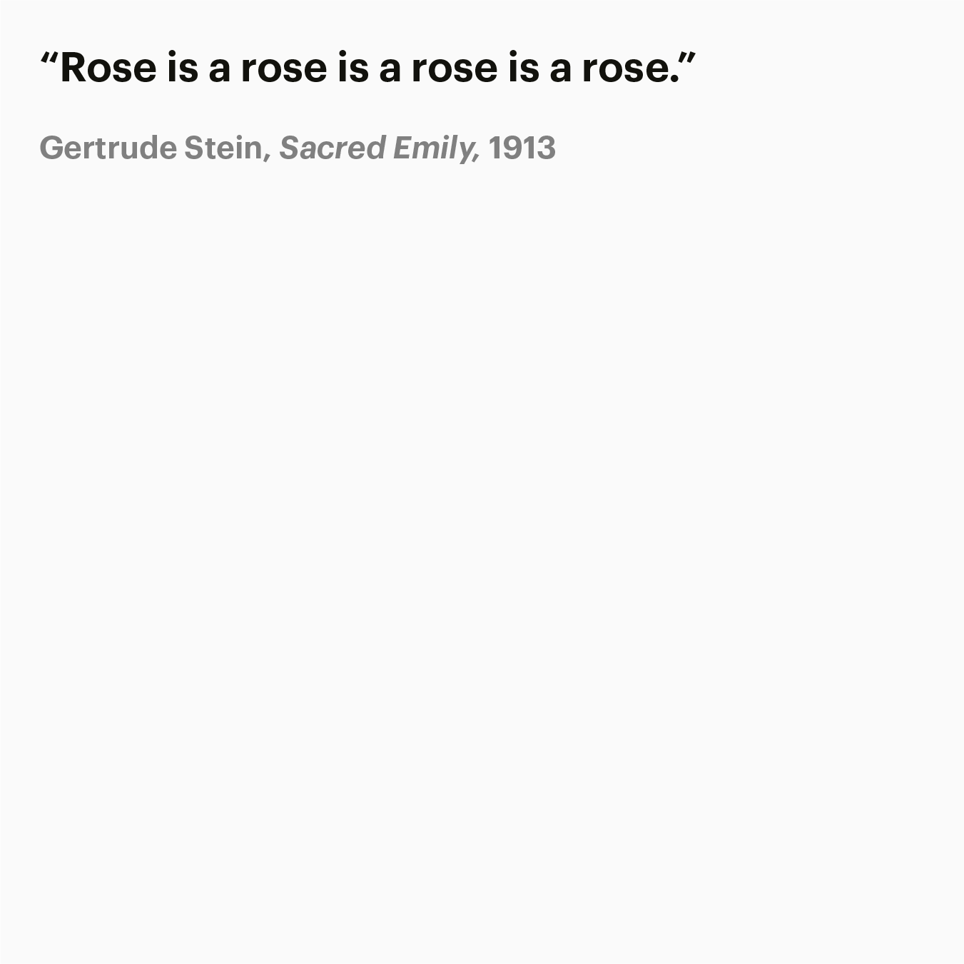
The dialectic relationship between ‘Imagining’ and ‘Science’ is mirrored in moving constellations, sometimes synchronous, at other moments the words change asynchronously. The different types of animated movements are based on human moods and behaviours, such as randomly searching, being hasty or nervous, or mellow and smooth, walk and sit, and so on. The logotype appears in singular or multiple static and animated formats. In rhetoric an epizeuxis, N2 is the repetition of a word or phrase in immediate succession, typically within the same sentence, for vehemence or emphasis. Repetition is also an often used style figure in the arts, such as in poetry, music and in art. In design and architecture repetition gives the user or viewer conceptual structure and supports the legibility of the design.
Light and dark mode
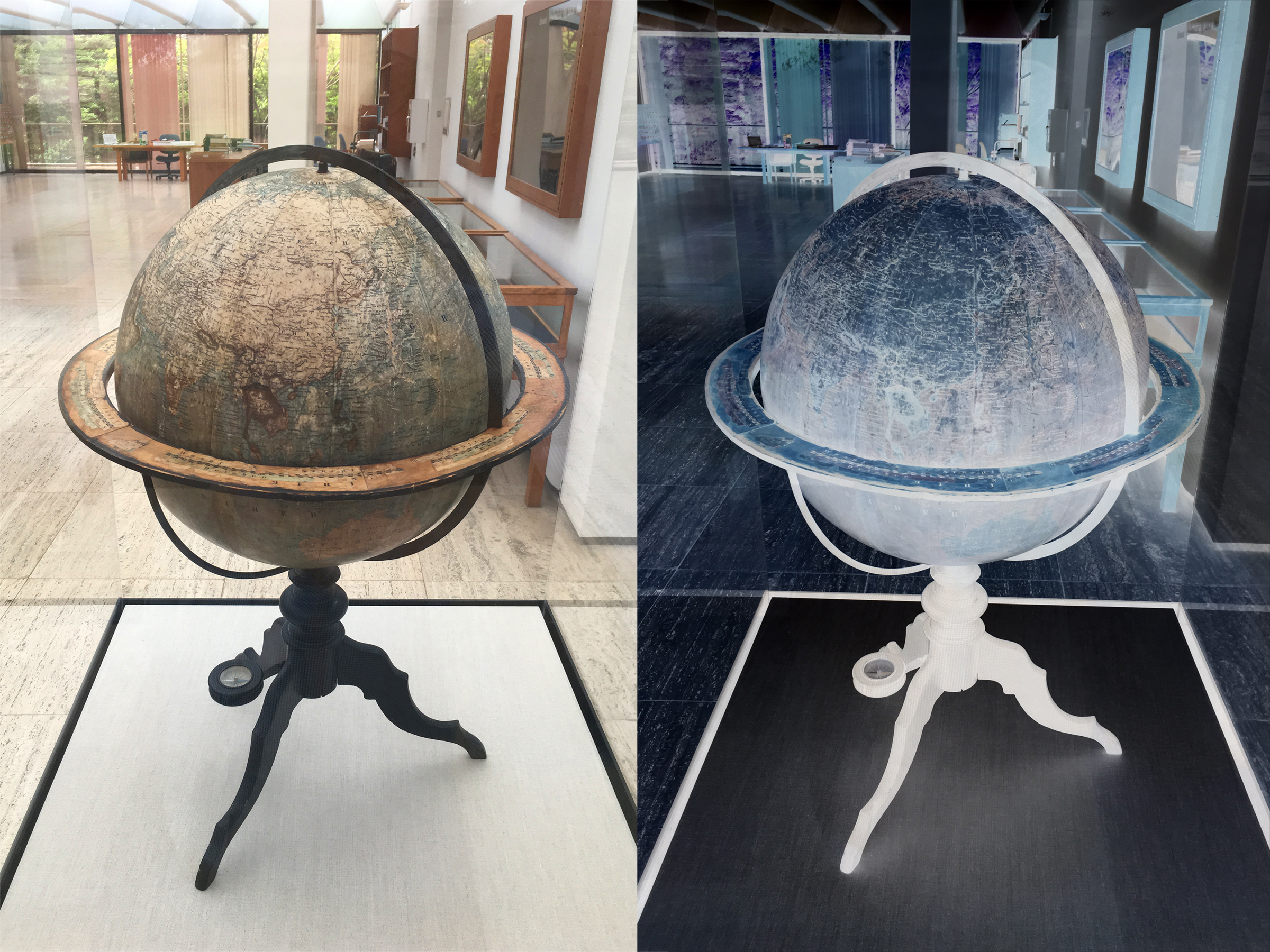
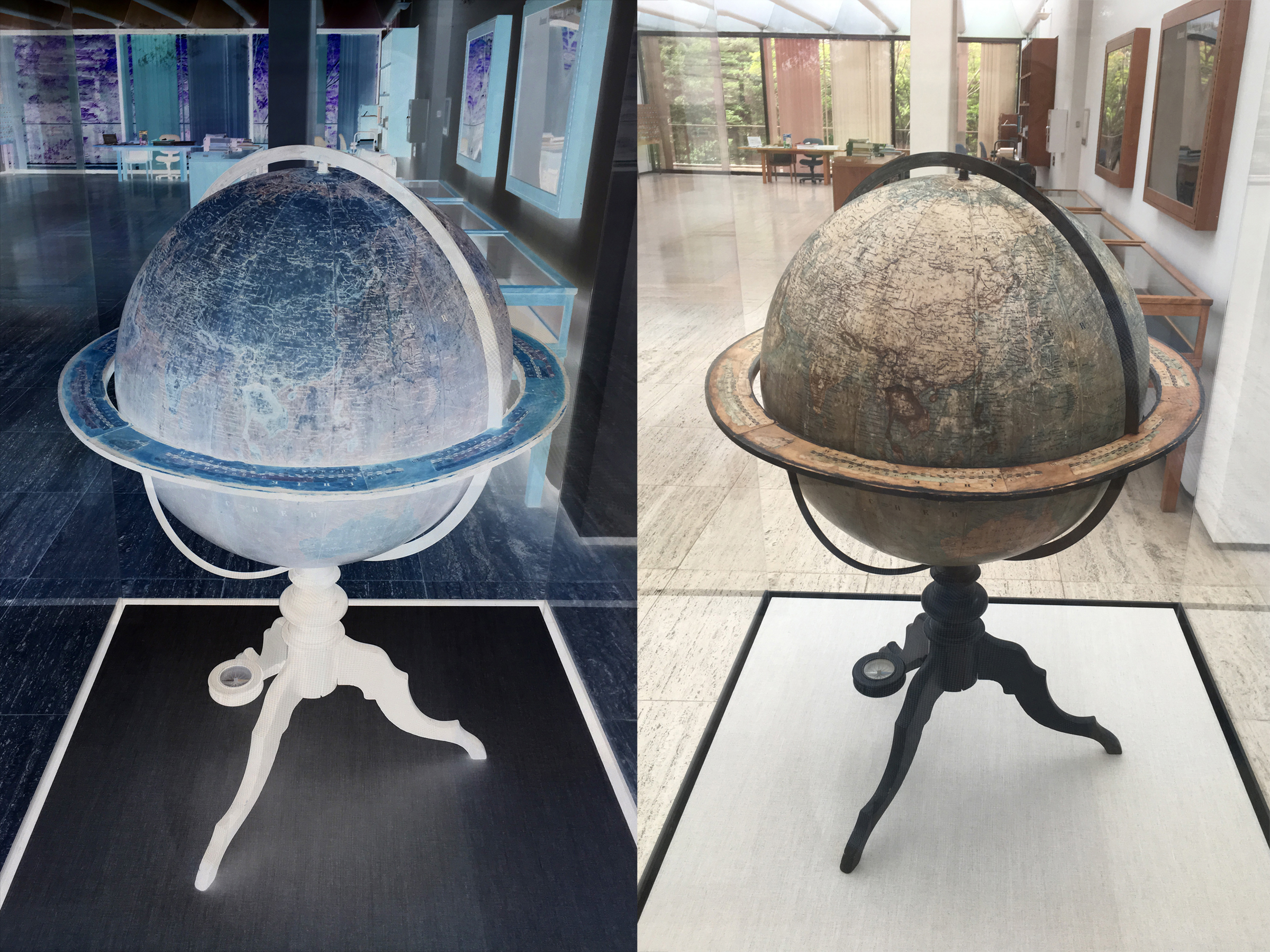
The design is based on a light and dark mode that is used for editorial purposes. The switching between viewing modes depends on the user’s reading preferences and device settings, which leads to better usability and legibility in dimmed situations. Each mode has a reverse color palette similar to the opposite colours of a photographic positive and negative. This allows a diversified and surprising color scheme which transfers the materiality of color into the digital realm.
Typography
The acknowledgement of the importance of language within science and design assumes a differentiated typographic design concept for the Imagining Science visual identity. This is understood as an alternative gesture to fast and feeble online communication formats which often make no reference to the content they intend to convey. Hereby a great sensibility for language, typography and details have been a guiding principle for the design.
The sans serif Graphik N3 is applied as the main font for the visual identity because of its straightforward and utilitarian character. The font is very usable in digital and analog applications with complex content that require multiple font sizes without affecting its readability. As secondary font, the slab-serif typeface Guardian Text Egyptian N4 is chosen for the design of discursive texts, such as long-reads. The font has a robust type design which ensures legibility in smaller sizes.


Communication items
The visual identity shows a high level of flexibility that can adapt to various content situations. These includes a website, social media content, film trailers and analogue communication formats. The typographic system is developed for the use in different text genres, headlines, notes and annotations as well as various types of media.
- Commissioner
Unbound Trajectories GmbH
- Location
Rotterdam, Zurich
- Project type
- Design research, Visual identity
- Field
- Creative lab, Design, Science
- Status
- Currently implemented
- Project lead
Evert Ypma
- Project team
Simon Davies (concept, graphic design), Evert Ypma (design advice), Floris Douma (web development)
- Collaborators
Markus Eberhard (animation), Luciano Baragiola (animation studies)