In 2004 the Erasmus Student Network decided to make a great leap forward by expanding its international network. ESN had the ambition to increase their presence and involvement in the European political affairs in Brussels and across Europe to better represent the interests of international student mobility.
This lead to the development of a distinct positioning on international, national and local level and public diplomacy strategy that, several development cycles later, is still progressed. Today, the Erasmus Student Network has become an established NGO within the international and local higher education ecology with sections in over 511 cities in 1000+ higher education institutions in 41 countries across Europe.
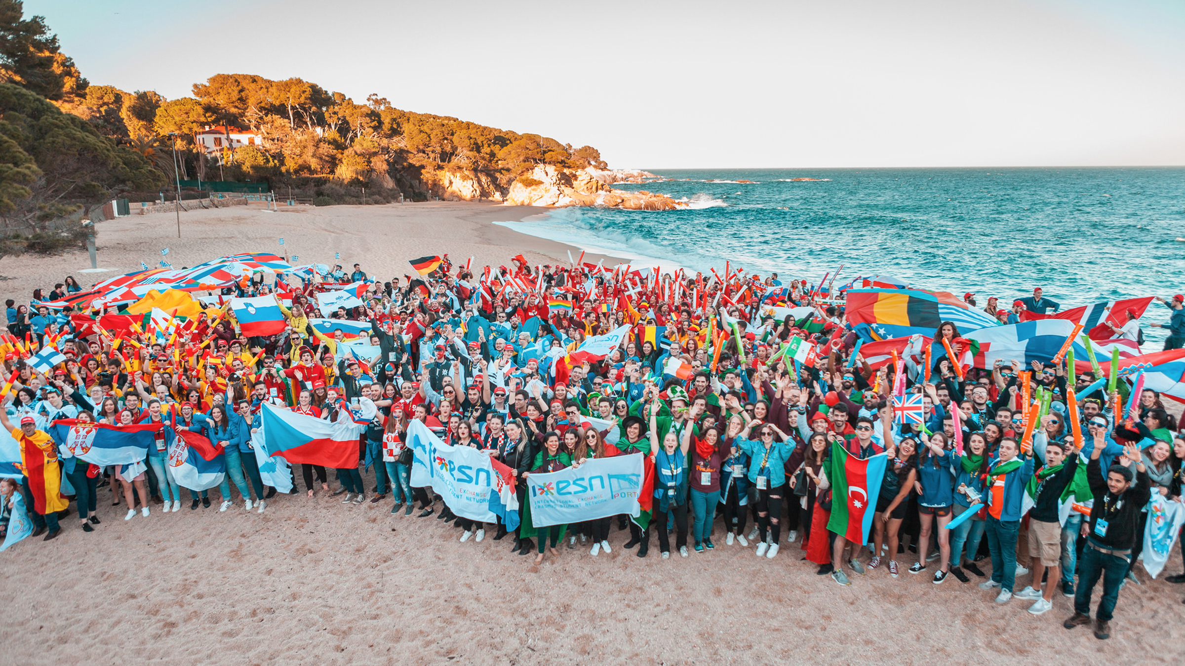
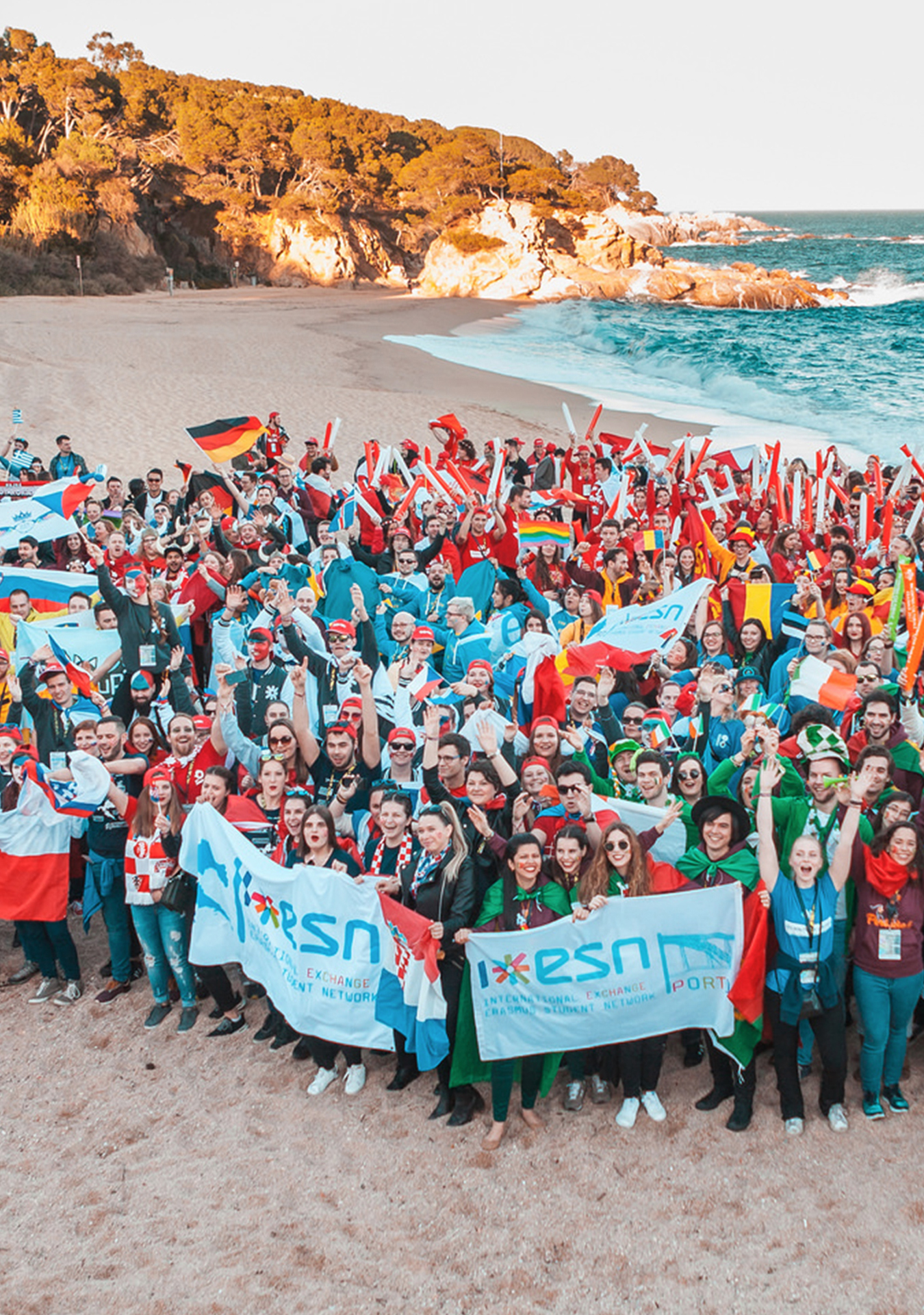
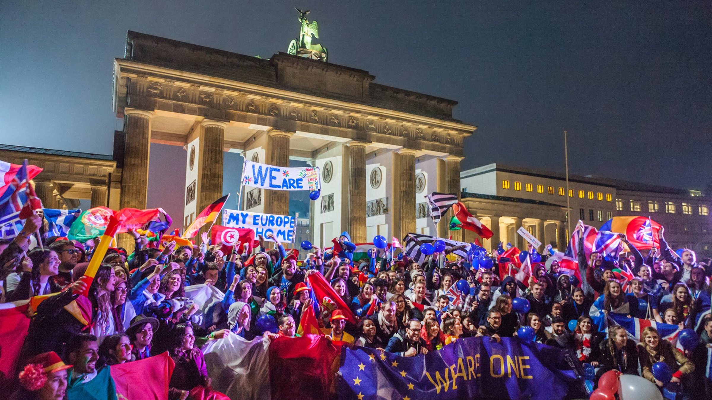
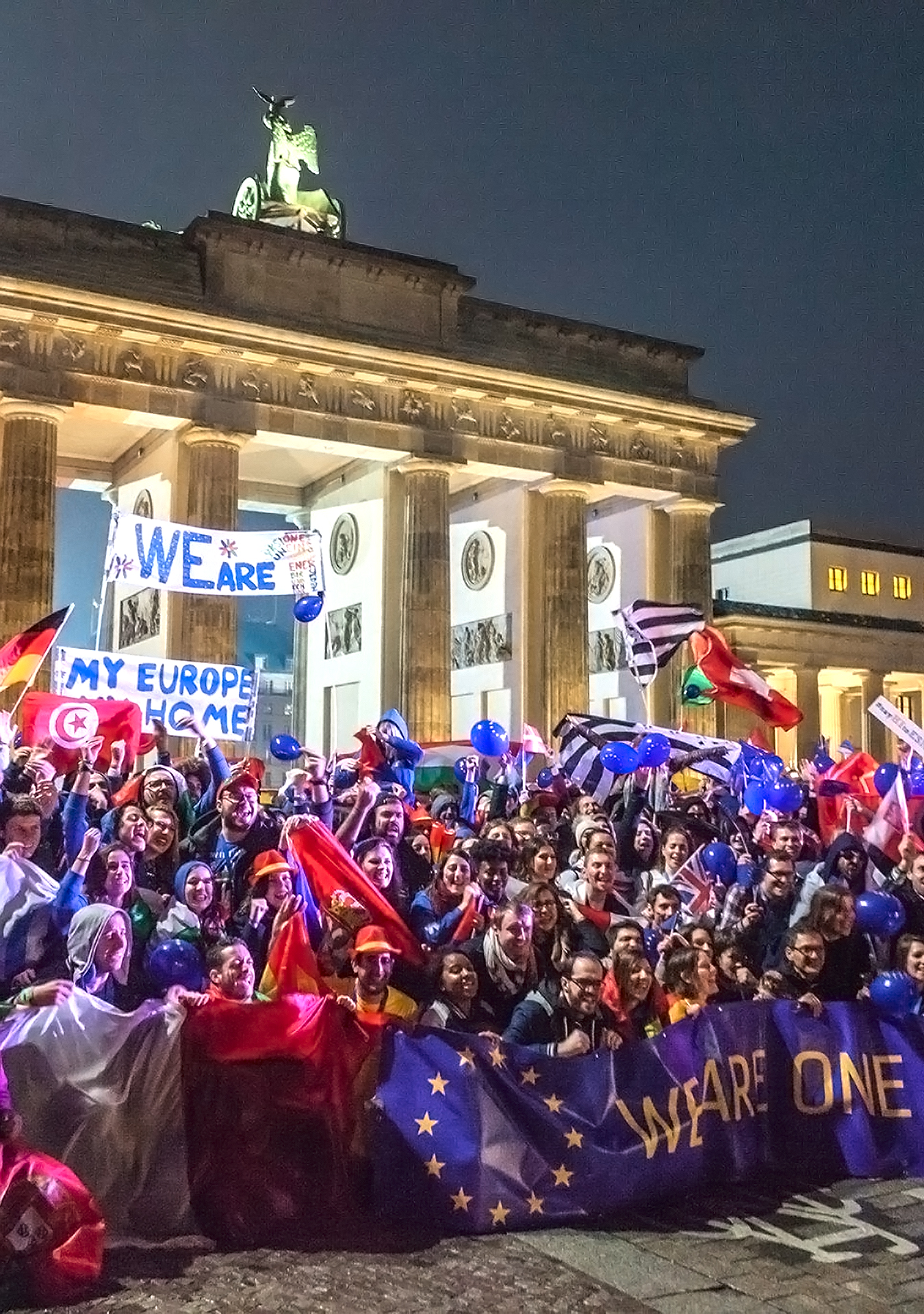
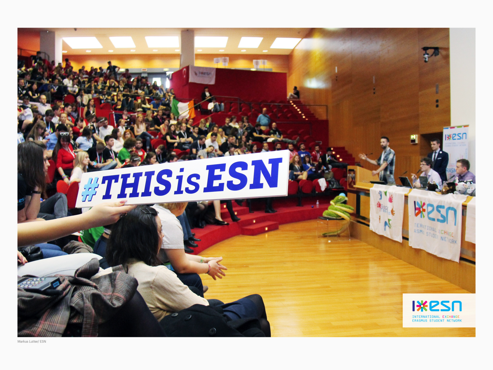
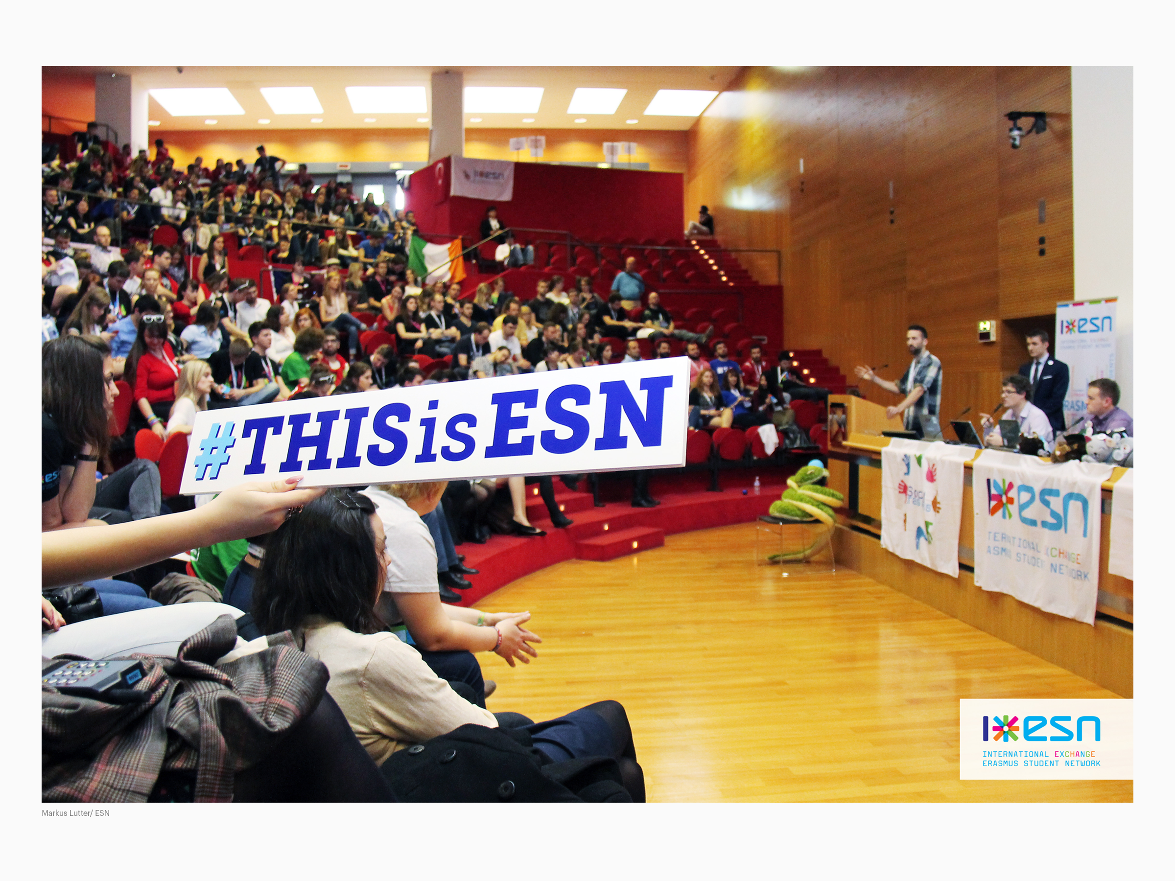
Erasmus Student Network is Europe’s largest interdisciplinary youth and student organisation in the field of learning mobility. ESN supports educational, social and cultural integration of international students and provides practical information about exchange programmes for incoming and outgoing students. In 2023, ESN has over 15,000 volunteer members in local student sections. Supported by buddies, under the principle of ‘Students Helping Students’, ESN involves around 40,000 young people offering services to 350,000 international students. The Erasmus Student Network is also Europe’s largest international alumni association for former participants in mobility programmes.
Historical development
Identity projects question roots and traditions of the past, the present and the near and distant future of an organisation. ESN went through a development from an amateur grassroots organisation towards a semi-professional and successively a professional organisation. The previous ESN logotypes form a chronological visual history that represents the various development stages.
Founded in 1989, the Erasmus Student Network unified students who went on exchange to foreign universities on grants from the newly established Erasmus Programme (today Erasmus+) N1 by the European Union earlier in the same year.
1990
ESN’s first emblem resembles a fusion of a flag in European blue and a seal with twelve pentagram stars representing the twelve member states of the European Union in 1989. N2 Also depicted is a contour of Desiderius Erasmus of Rotterdam, N3 the namesake of the EU’s Erasmus Programm. This nameless emblem served for almost a decade.
1999
The name Erasmus Student Network was represented by the acronym based on thin geometric lines that formed the abstract letters “e s n”.
2004
The acronym was adapted and enhanced to make it more legible: the lines were made thicker and placed on a blue oval flanked by the credo Exchange your life! in a typical 90’s letter font, the FF Providence. N4 The full written name Erasmus Student Network in the geometric slab serif font Rockwell Condensed. N5 The result is a mixture of different visual styles without visual and conceptual consistency.
2006
Repositioning project by ESN Board and Evert Ypma, designed by Koeweiden Postma.
Positioning and design strategy
From 2005-2006, Evert Ypma advised the ESN Board on organisation identity, positioning and brand development as well as on the design process of a distinct visual identity.
Design assignment
What ESN is and what it stands for had to be specified since for outsiders its purpose was fuzzy. The organisation’s name was extended to International Exchange Erasmus Student Network.
The various platforms and initiatives of the pan-European network on international, national and local level needed to become visually connected and identifiable as one organisation.
The brand and visual identity had to mirror the expressive nature of a vibrant student organisation. Additionally it had to be distinctive and recognisable in communication contexts of public administration in which black and dark blue logotypes dominate. A new visually simple and strong symbol was needed that could be used in different cultural contexts and languages.
Also needed, was an easy-to-use toolkit that could be applied by local members. Developed just before the rise of the smartphone and social media, the visual identity had to meet the requirements of online communication.
ESN Star
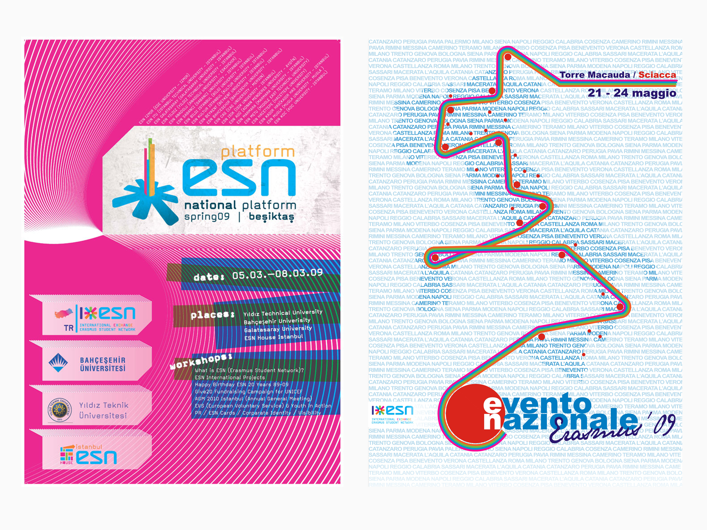
The Amsterdam based design agency Koeweiden Postma (Amsterdam) N6 was commissioned to design ESN’s new visual identity.
This lead to the development of the colourful ESN Star, which stands for ‘I 🖤 ESN’, or in full text: ‘International Exchange Erasmus Student Network’ that soon became central symbol throughout ESN. The color programme is based on additive color mixing mirroring the interwoven and collaborative spirit of ESN.
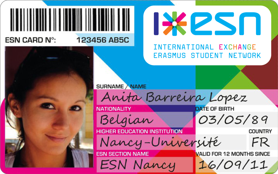
Design: Koeweiden Postma, Amsterdam, 2006
Visual identity project as catalyst
The repositioning and visual identity initiative has catalysed the organisation significantly. In 2005, ESN opened a headquarter in Brussels for the board and secretariat to improve the services and support to the network. Budgets and the number of staff increased, communication strategies made ESN more visible and better understood by its stakeholders. The presence of ESN within the context of policy making improved. While developing, ESN remained faithful to its grassroots identity based on exchange and collaboration.
In 2019 the ESN brand design has been adapted to the needs of the growing organisation and the communication demands of contemporary digital media. N7 The ESN Star continued to be the organisation’s key symbol to build a global brand.
Visual identity as open design
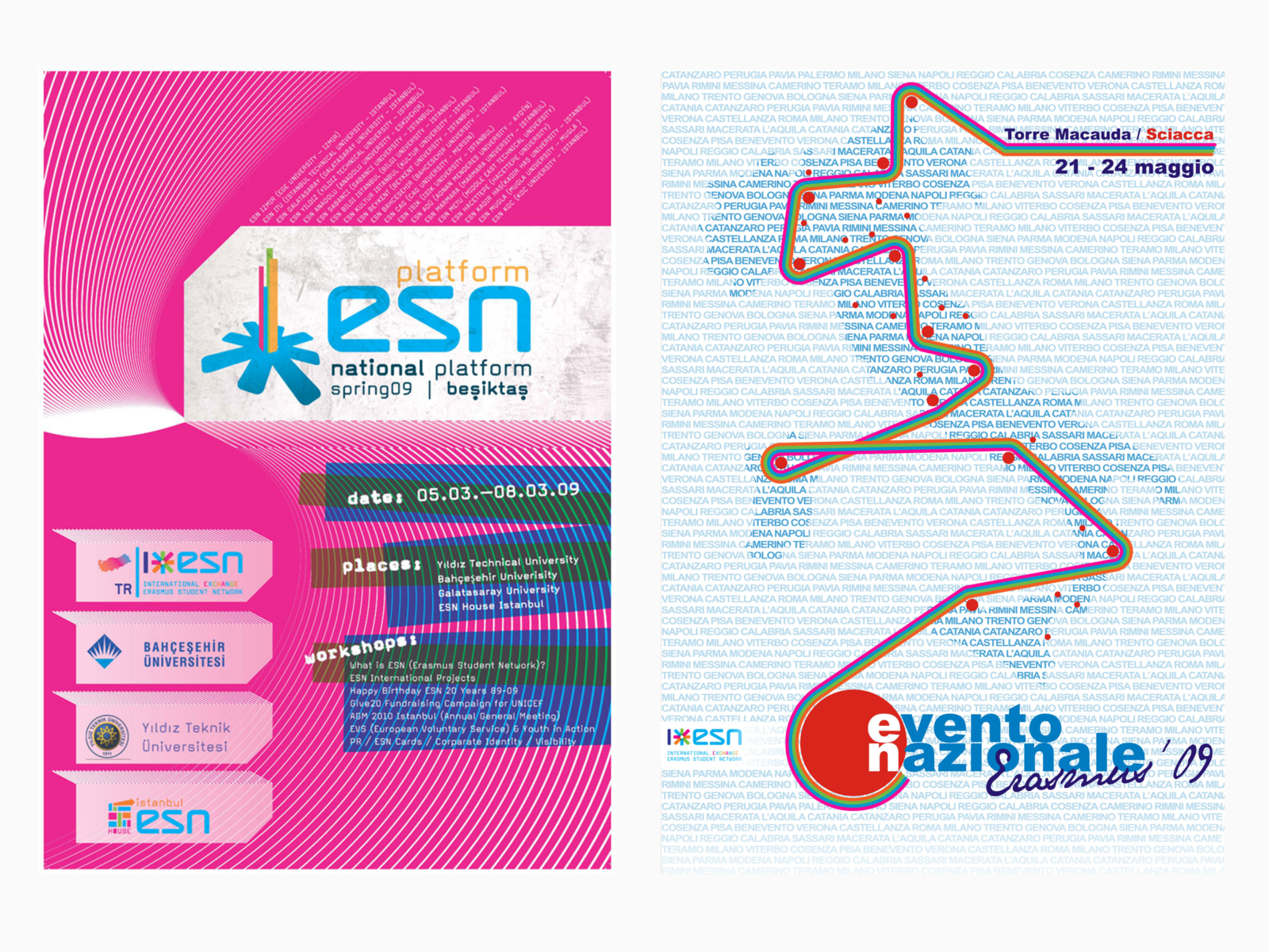
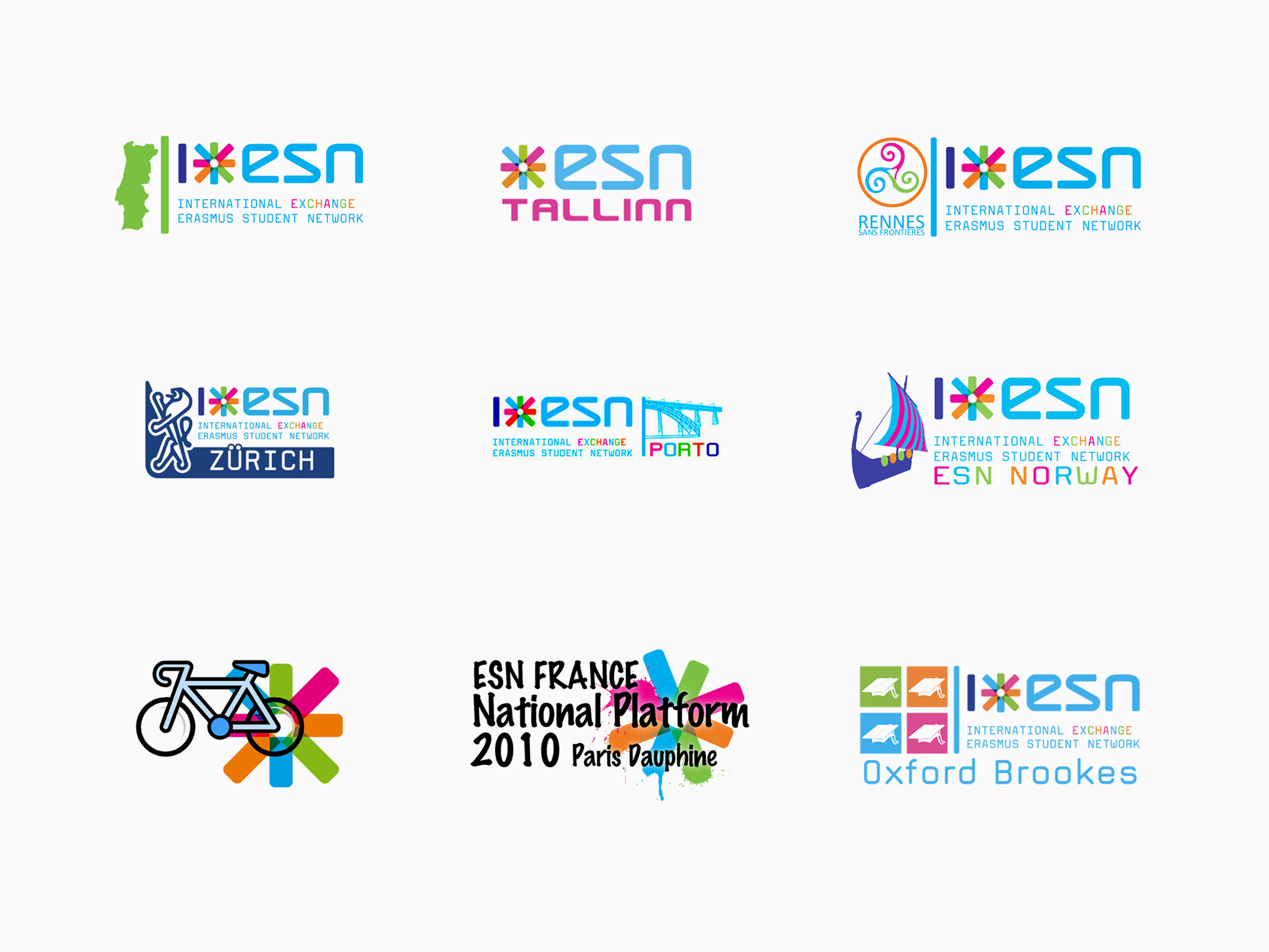
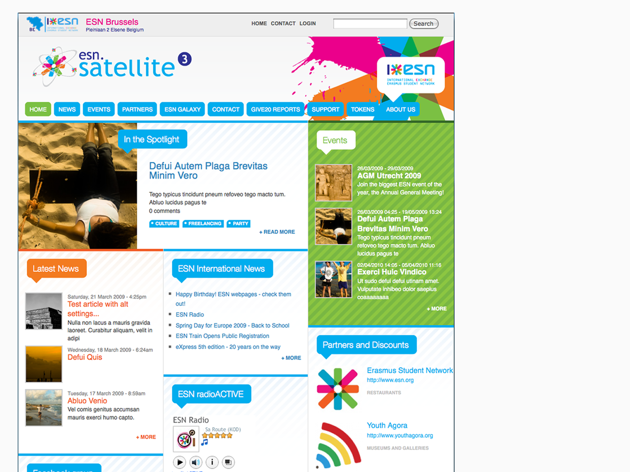
The ESN organisation is characterised by its highly participative mentality in which individual members and groups are invited to contribute at various levels of the organisation. The corporate design toolkit encouraged section members to develop their own design adaptations based on the provided visual language.
This open design concept resulted in infinite variations of the ESN visual identity, which resembled the organisation’s diversity. In the years after, and finally in 2019, the ESN Board and General Assembly decided to coordinate the ESN visual identity and communication policies more strictly.
- Commissioner
Erasmus Student Network
- Location
Brussels
- Year
- 2005-2006
- Project type
- Brand assessment, Brand strategy, Consultancy, Positioning strategy, Visual identity
- Field
- International NGO
- Status
- Completed
- Project partner(s)
Design: Koeweiden Postma, Amsterdam
- Project team
Davide Capecchi, ESN president 2003-2006
Evert Ypma
ESN International Board
Designated commission and individual members


